Design Consistency Guide UI and UX Best Practices
One of the key design principles, no matter if your designing a mobile app or a desktop one, is to keep your UI consistent. But what does it mean? How do you achieve consistent user interface? Which design decisions you need to make to achieve that? It’s time to explore that.
Good UX design doesn’t come from following UX design best practices. You need to test your product to tell if it offers great UX and fulfills user needs. That’s where prototyping tools come in. With a tool like UXPin, design teams can prototype their product, and then optimize their design through series of iterations and usability testing with real users.
No need to switch between tools. Try UXPin and see how fast you can prototype web apps, mobile apps, and websites. Sign up for free UXPin trial.

What exactly is design consistency?
Design consistency is what ties UI elements together with distinguishable and predictable actions, which is key for great product experience and an important thing to consider for UX designers. A way to simplify things is to think of it as a commitment that you make to your users (“whenever you see the light grey button in the pop-up on a homepage, you can assume that it will cancel and the pop-up will close”) so that they can easily interact with your product.
As they become more acquainted and become regular users, they begin to trust the product more and more, which is a reflection of the consistent design. To provide users with a consistent UI, here are UI and UX best practices I’ve found useful for product design.
9 UI and UX Best Practices for Consistent Design
Start with research
Nothing is more important for a consistent experience than quality research.
This should not be underestimated or hurried. Time and budget are always a necessary consideration in product design. Without either of these, a product would never ship. Although they are important to the process, we can’t lose sight of who actually uses the product, what their customer journey looks like, whether they are desktop or mobile users.
Keep your users top of mind and don’t overlook UX research in the beginning stages of product design planning.
Define user goals
Get into the mindset of a new user. What do they want to accomplish? How will the application help them? List our goals and refer back to these throughout the UI or UX design process.
For example, let’s assume we’re building a travel app. This travel application allows users to select a vacation timeframe and find deals on flights and hotels within their budget. But it’s not just the standard travel site. It connects to your Facebook account, works its magic, and plans the top five vacations based on the content that you’ve shared. The user selects the vacation plan that they like best and all the details are taken care of.
Here are some of the user goals:
- View vacation options within a specified timeframe
- Compare different vacation options
- Select a vacation based on users interests
- Keep within vacation budget
Now that we know the breakdown of goals, we can design to meet user expectations.
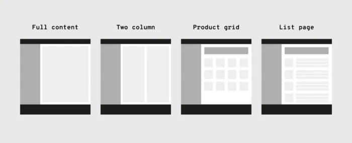
Familiarize yourself with common UI patterns
Don’t reinvent the wheel when it comes to established UI patterns. Recurring patterns solve common UX and UI design problems.
Of course, UX designers shouldn’t just “copy” the entire layout of another similar web or mobile app. They need to filter and modify the patterns based on specific user goals.
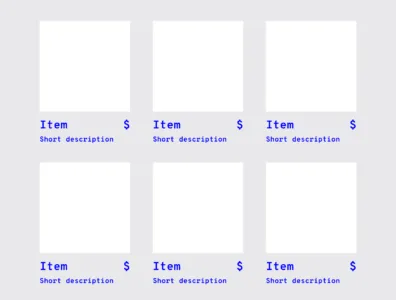
A typical pattern in eCommerce is a product grid. With this pattern users can easily browse and see product information.
It’s safe to say that patterns have been evolving and users become aware of standard locations for elements. Most users would agree that when they want to search for something, they look for the search bar in the upper center or right since this is a common placement.
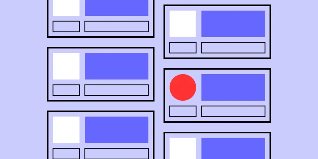
Establish design patterns for product UI and UX design consistency
One of the keys to a successful — and consistent — UI is the user performing tasks with the minimum number of actions is. If a task that takes four steps can easily be completed in two, the UI should always be modified for the shorter task flow. UI patterns can help with this… after all, this efficiency is why they became patterns in the first place.
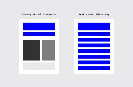
Design hierarchy
Along with design patterns, having an established visual hierarchy of UI design elements does wonders for UI consistency. Whether users are aware of it or not, they instinctively pay attention to the order and priority of the elements they interact with.
When it comes to visuals and the human eye, some elements take precedence over others (bigger sizes, bright colors, etc.), depending on how “noticeable” they are. Think about your screen visuals in terms of what people will see first, second, third, and so on.
This allows UX designers to ensure users find primary functions faster than others, but they can also present secondary and tertiary functions with the appropriate amount of attention.
UI elements
There is a multitude of design elements that go into an application’s UI, and each makes up the building blocks that form UI patterns. Keep an organized inventory and check that elements are used properly to maintain a consistent experience.
Branding elements
Stay consistent with the overall brand. Typography, logo, correct image styles, brand color schemes, etc. should be reflected in the application, just like the rest of the brand’s properties.
Is the correct logo used? Are branding colors consistent? Does the typeface match the others? Brand consistency helps new projects feel like part of the brand’s family, rather than a black sheep. Style guides usually provide all the information you’ll need.
Making sure colors and typography are on brand gives each of the company’s products a consistent look and feel.
Typography
Elements with the most visual impact like typography should always be “on brand.”
This visual element is especially important, not just for hierarchy, but for the entire UX as well. Changing the sizes, fonts, and arrangement of the text can improve scanability, legibility, readability, and even navigation.
UI components
During user research, become familiar with UI patterns and their components. Knowing how each component behaves, within the pattern and outside it, lets UX designers properly prioritize all elements on the screen without anything slipping through the cracks.
“Components” can refer to any number of elements that make up a pattern, such as:
Let’s say you’re considering adding pagination to long lists so the user doesn’t have to scroll far with long lists.
As you examine the wireframes, you notice that one list has pagination with 20 or more items, while in another part of the application, a list only has pagination with 40 or more items. Which is correct? This example illustrates how making definitive decisions about guidelines is the backbone of UI and UX design consistency.
Templates
If you’re having difficulty standardizing your site or app, try using templates.
Most applications allow them, and because the layout and elements look the same, they streamline UI features across the products. Plus, you can reuse the same UI templates over and over, even years down the line.
Pattern library and design system
It may not be user-facing, but it is one of the keys to consistency. Today, many teams have a pattern library or design system as a point of reference to keep everyone on the same page. Pattern libraries and design systems are the rulebooks that anyone on the team can reference at any time. For team-wide consistency, they are essential.
A pattern library may not be as robust as a design system since it’s limited to design patterns specifically. A design system has more information all around, including helpful documentation about all the UI patterns and various components. A pattern library can also be a subsection of a design system.
Make actions consistent
Everyone loves when an application is user-friendly. It saves time, avoids headaches, and helps users accomplish their goals by eliminating confusion — all requirements for creating satisfied customers.
Consistent actions remove the need for user discovery and therefore make their task flow run more smoothly. If a user knows how to use the functionality in one section, they know how to use it in all sections (as long as it’s consistent).
Users inherently transfer past knowledge to new contexts as they explore new parts of the application. Consistent actions become second nature and eventually, the user can use the application without even thinking. Furthermore, users bring these expectations into new features or aspects of the product that they haven’t explored yet, minimizing the learning curve.
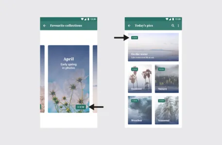
“View” placement is not consistent. On most of the cards, it’s toward the top, but on the collection card, it’s at the bottom. This inconsistency might cause the user to pause for a moment to search for the “View” option, not to mention it undermines their own natural habit-forming processes.
So what, specifically, should you consider when designing your interface? Ask yourself these questions during the entire process:
- Do all parts of the application behave the same way?
- How do interactions work? Are they predictable and consistent?
- How much discovery is needed for a user to understand this interaction?
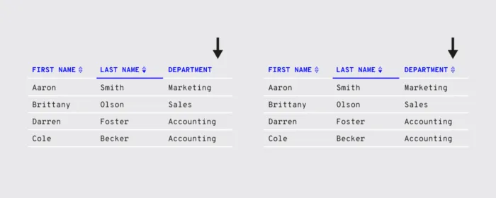
The example on the left has inconsistent sorting; not all columns have the option to sort. Users may want to sort data in other columns. The example on the right has consistent sorting on all columns.
Review your content
It’s not just about the visual elements, but also the text throughout the application.
Consistent copy — especially consistent terminology — in each place in the application is another key. Using two different words for the same function makes them seem like different functions, causing a momentary pause in the workflow while the user sorts out the discrepancy.
Consistent copy avoids this confusion.
Content structure
Content plays a crucial role in UI elements, whether something as simple as navigation listings or as complex as product documentation. It’s not just the words themselves, but how to copy text is presented visually, such as body copy, list items, table content, etc.
In particular, pay attention to how content is handled in these areas:
- Navigation
- Dropdowns
- Form fields
- Validation messages
- Tooltips
- Charts
- Image captions
- Error messages
- Loading screens
- Confirmation pages
- Product support documentation
Brand consistency in content
You know that feeling when a certain part of an application feels “off.” A lot of times the reason is an inconsistency in the content’s language, for example, if one button says “Logout” and another says “Sign out.”
Even less noticeable inconsistencies can create that “off” feeling.
For the Oxford comma fans out there, something as “minor” as comma usage is picked up subconsciously. After enough of these subconscious flags, the user’s conscious brain starts to notice.
Other writing guidelines such as title case and voice/tone also influence the user’s experience. While title typography is more empirical, voice and tone are a little harder to pin down. The trouble escalates if most content uses a casual style that clashes with a more formal “brand language.”
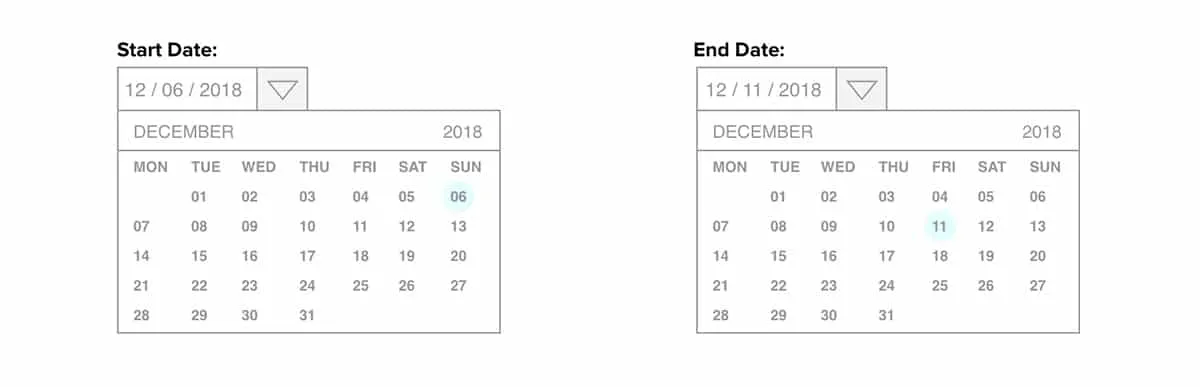
Appropriate user defaults
By considering user goals upfront, you can set realistic defaults to reduce the burden on the user.
If the defaults are set to the most popular preferences, the user may not have to make any adjustments at all. Take the date picker on an airline or car rental site. Often the starting default date is sometime in the near future, the most likely choice according to past statistics.
Pay close attention to forms, too; they’re a great opportunity for defaults to reduce the amount of user effort.
Consistent communication
Search results, form submit messages, error windows — every interaction with your user is communication. For an app to be successful, it must speak to the user and keep them informed on what’s happening. And, as with everything else, the way you communicate should be consistent.
Changes in state and helpful information
Users appreciate feedback: a toggle that changes color to indicate “on” or “off,” for example, or a sound effect to verify a completed action.

Your user should never waste time wondering whether an action took place or not. Form field submissions are notorious for this, but it happens in other areas as well. In situations where it may not be clear, a quick success (or error) message is all you need.
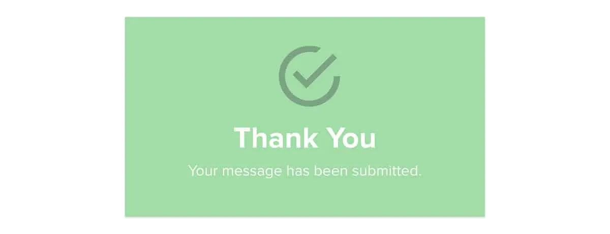
Play it safe. Even when it’s apparent that the action was successful, a lot of users still prefer a quick confirmation.
Reduce user frustration
The most common cause of user frustration happens when it’s not clear what to do next. Some tasks are not so self-explanatory, but UI and UX designers are often too close to it to notice. Luckily, some instructional text — even just a line or two — can solve the problem.
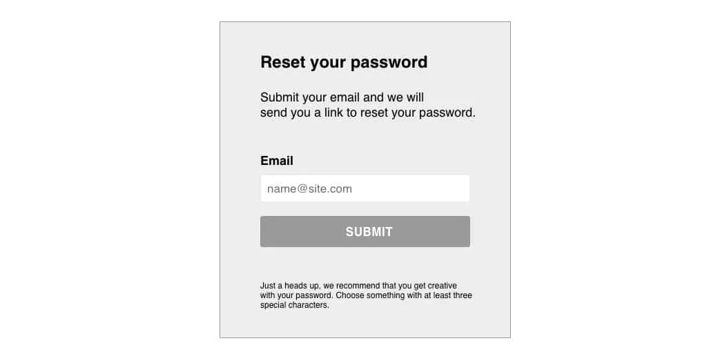
For the same reason, error messages are useful too. While users may not like seeing them, they still need to know what happened and how it can be corrected.

Level Up Design Consistency with UXPin
Consistency in UI is a huge undertaking, and it’s easy for some parts to slip through the cracks. The end goal is, of course, a perfectly consistent and in-sync interface, but that’s not always possible right out of the gate.
For startups, you can try an MVP (minimum viable product). Even if the product starts out with some inconsistencies, your team can iron them out one by one over time once you start receiving feedback.
If you’re making updates to an existing product, it can be more difficult to remain consistent. This is where the right prototyping software comes in handy. UXPin allows you to build interactive prototypes fast and keep them in line with your design system. Try building your prototype with UXPin today.