
By Pablo Diaz-Gutierrez
President Dwight D. Eisenhower once said
“What is important is seldom urgent, and what is urgent is seldom important.”
It seems obvious if you think about it. And yet, in this age of information overflow, I bet you are also guilty of task management by email: A new message from a customer, your boss or a coworker often makes you turn your priorities on their head. That little red number telling you how many unread messages you have is so hard to ignore. It’s just human nature, we are wired to pay attention to things that change unexpectedly. We don’t even realize that we are trapped in multi-tasking and the illusion of work.
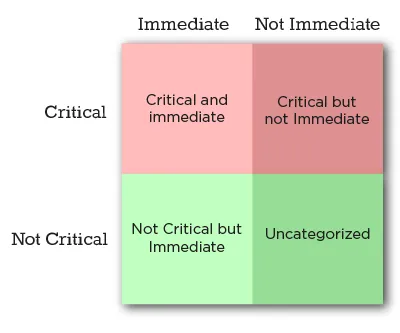
This problem is so common that several authors have built successful careers on helping people deal with it. Many of them draw, with credit for it or not, from the so-called Eisenhower Matrix. The goal of this method (described in his diaries) is to classify everything you have to do into a 2×2 matrix, where critical (important) things go on the top half, and immediate (urgent) things go on the left side. This way, everything we have to do falls into one of four categories:
- Critical AND Immediate: Do this now, it’s an emergency
- Critical: Spend most of your time and effort on these tasks
- Immediate (but not critical): If you can delegate this to someone else, do so
- Everything else: Stuff that falls here doesn’t deserve your time
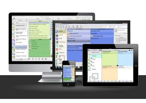
At Appfluence, we develop a suite of tools called Priority Matrix. This post describes the design decisions we made early in the development process when we were still trying to figure things out. It used to be that developers working on a new tool would have to start from the bottom up, developing low-level UI elements that, when put together, would bring their products to life. Today, modern development tools and powerful frameworks have come a long way. Creating a full, polished product is now easier and faster than it ever was. But this convenience came at the cost of suffocating nearly all originality in user interfaces. When presented with the task of designing the Priority Matrix, we decided to do the right thing and deliver a pleasant, unique experience that serves our users well.
One way to think about design choices is in terms of a spectrum of possibilities that ranges from hastily putting off-the-shelf components together, all the way to developing complete UI elements from scratch. The former has been done time and time again, and the results are invariably unsurprising. Software outsourcing houses churn examples by the dozen, and they don’t make a blip on anyone’s radar because they’re more of the same. The latter, on the other hand, requires a lot more effort, dedication, and frustration until you get it right, if you ever do. But if you succeed, the result is a unique, well-fitting UX that your users will hopefully love. We went that way, and after iterating several times, we settled on a design that made us happy.
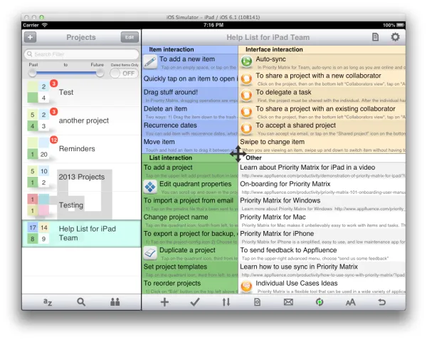
The first and most obvious decision to make was how to implement the four quadrants. Our original constraints were the following:
- Each version had to feel native to the platform, to differentiate from quick ports
- The UI had to be touch-friendly since our first release was for the iPad
- The quadrants had to be resizable by the user to focus on one section, or else we would waste a lot of screen real estate
Given the task to design a 2×2 matrix, the quick, first approach would be to show some buttons to maximize each quadrant, to reassign items across quadrants, and to change projects. We did this as a proof of concept, and it felt clunky. As it didn’t fit our requirements, we moved on. The next iteration would allow the user to drag the edges between each quadrant in order to resize them as needed, horizontally or vertically. This was an improvement over the first attempt, but it still didn’t feel native on the iPad: It was like a Windows app ported to a tablet interface. Also, in order to be usable at all, the edges had to be pretty wide, in order to allow the user to drag correctly. This would also have made us waste a lot of space, which we couldn’t afford on a smartphone or tablet version.
After much sketching, head-scratching and contemplation, one of us (I can’t remember exactly who) proposed having a central button that users could drag to resize the four quadrants at once. That was just right. Even though this was a non-standard UI element, users were able to identify the functionality at first sight (the icon helps with that). Because it’s just one button, we could easily afford to give it sufficient space to be easy to drag. And best of all, it is just fun to use. Even this long after we first released the app (it came out on day 1 of the iPad era), we still turn heads when we demo this particular feature. In retrospect, we wouldn’t do it all the time, but the effort we put into carefully designing from scratch paid off in scores.
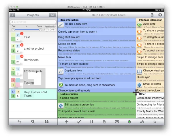
The resizable quadrants are the signature element of the Priority Matrix interface. But the same careful, iterative design process was used to come up with other interactive elements. For example, items can be rearranged (re-prioritized) by holding a finger on the item and dragging it from one quadrant to another. We did this because we felt that the default iOS table reordering gestures were a bit clunky when working with multiple tables side by side. In addition, the iPad version of the app exploits the device’s multi-touch capability beyond the standard pinch and swipe operations. When dragging an item with one finger, a second finger can be used to change projects, reassigning the item to a different context. Little things like these makeup complete user experience. It pays off to step back and think through every now and then.
The design approach we propose here is not for everyone, every time. It is time-consuming, demanding and uncertain. However, as we said before when it works, the results speak for themselves. As mobile, tablet and web development frameworks evolve, it will become increasingly clear which UI and UX conventions stick and which ones are phased out. Until then, I recommend that you set clear goals and take a chance to explore the possibilities that your platform offers. Just don’t be a copycat.
Author:
Pablo Diaz-Gutierrez is a co-founder at Appfluence. They make Priority Matrix, a simple and effective task management software tool for busy people. Pablo is interested in all things productivity, and he would love helping you go home on time to enjoy the simple pleasures in life.

