
I sometimes wonder, is design progressive? That’s a tough question. Let’s break it down a little. Maybe we could compare some big names in the online world and see how they looked at launch and what did they do with their design?
Did they make any progress in design? You be the judge:)
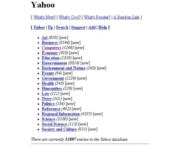
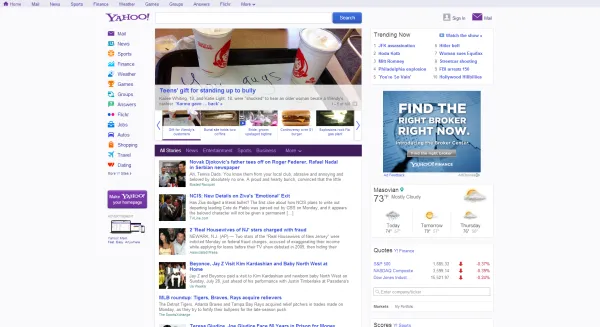
1. Yahoo (website launched in 1995)
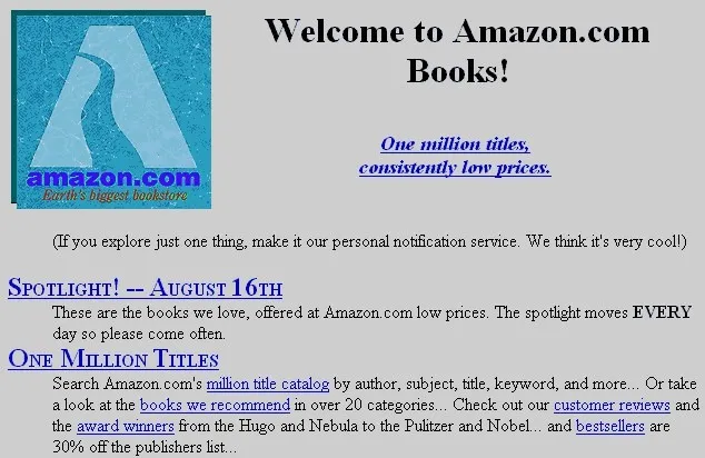
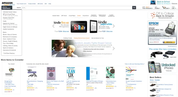
2. Amazon (1995)
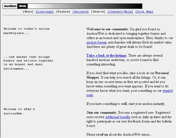
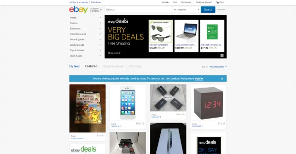
3. eBay (earliest screen available is 1997)
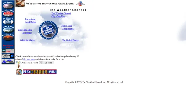
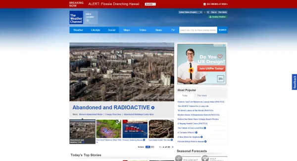
4. Weather.com (1996)
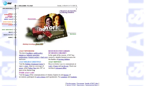
5. AT&T (1996)

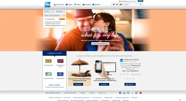
6. American Express (1996)

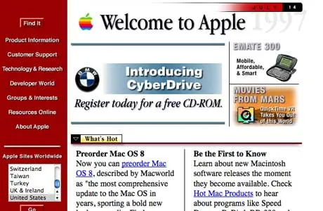
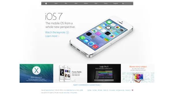
7. Apple (1996)
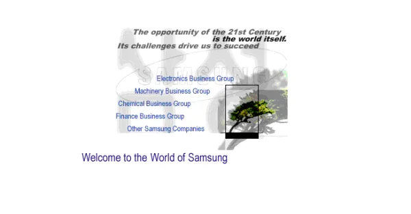
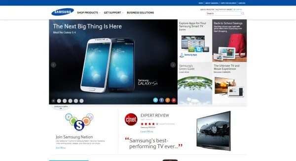
8. Samsung (1996)
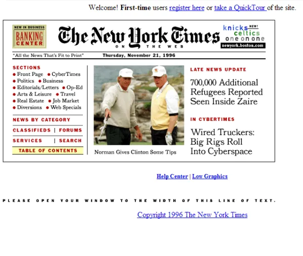
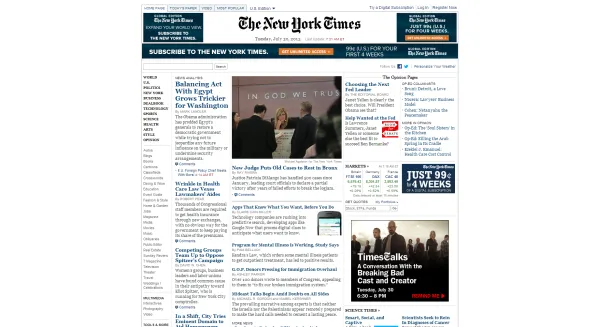
9. NY Times (1996)
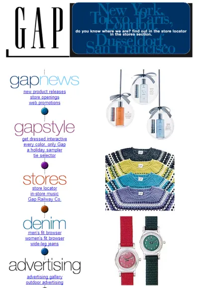
10. GAP (1996)

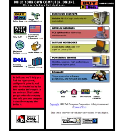
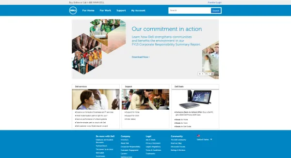
11. Dell (1996)
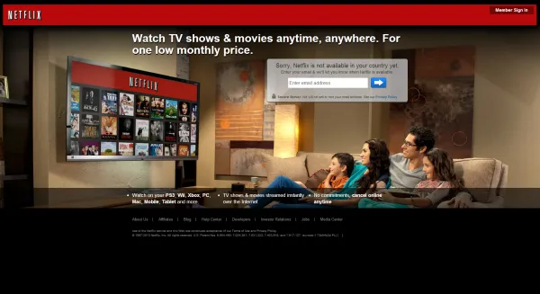
12. Netflix (1997)

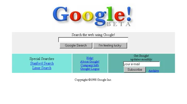
13. Google (1998)
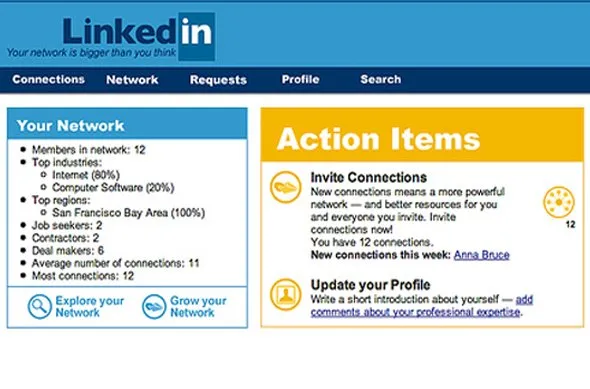
14. Linkedin (2002)
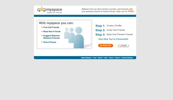
15. Myspace (2003)
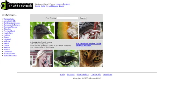
16. Shutterstock (2003)
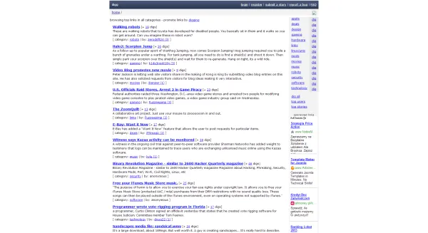
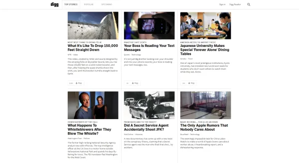
17. Digg (2004)
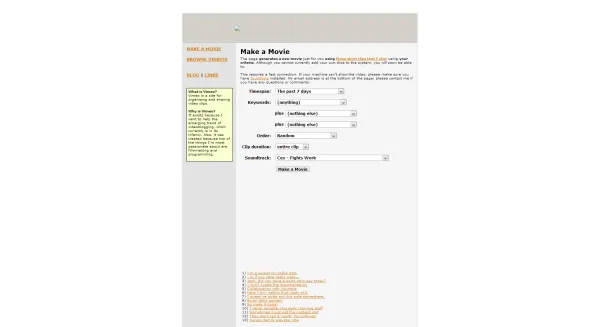
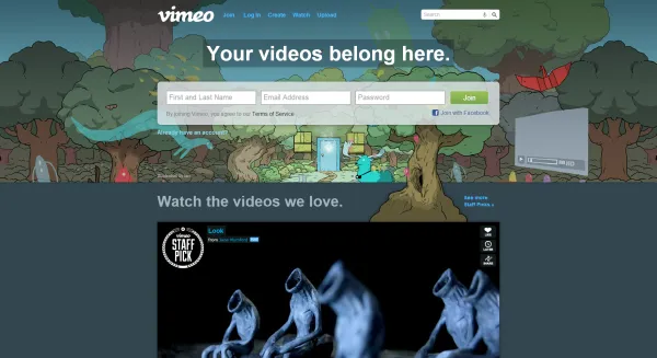
18. Vimeo (2004)
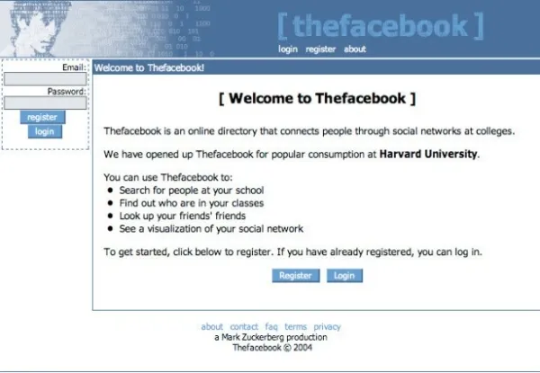
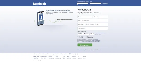
19. Facebook (2004)
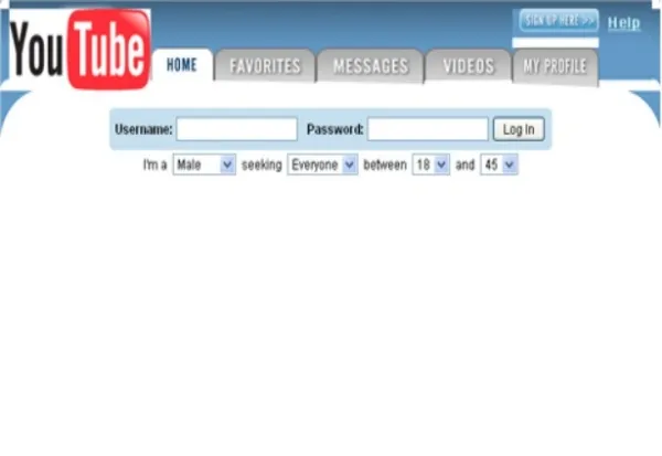
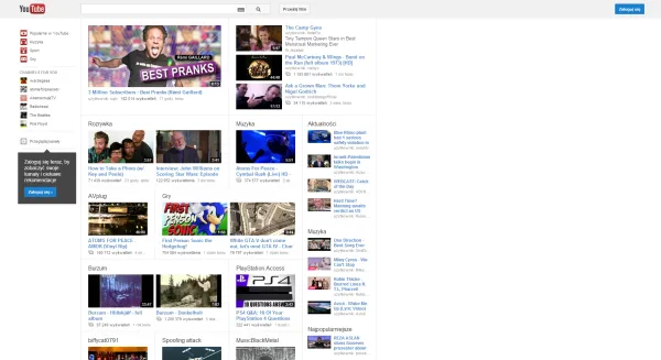
20. Youtube (2005)
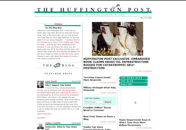
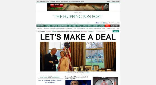
21. Huffington post (2005)
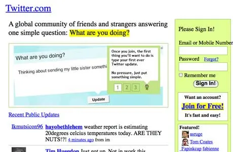
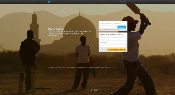
22. Twitter (2006)
A crazy adventure, wasn’t it! I remember that seeing those sites live “back in the day” was a completely different experience than looking back at them from a years perspective. Maybe you had a similar feeling that back then, what you see above was completely normal, even typical. Really, those sites aren’t the ugliest, crappiest websites of the 90s – this is how the online world looked. Seeing them now is like living in a world where nobody cares about user experience, all visual designers became radical bohema and no machine couldn’t handle the convoluted gears of CSS.
What would make a difference back then would be a reference to good website design (which unfortunately was hard to find). Come to think of it, the reference to designs that feel way better is the main factor that makes the oldies look so silly now. We compare them to standards of modern times where things changed dramatically. Remember, this was a very early market!
Not only technology enabled more daring and dazzling design. The reference principle moved on as well. In market terms, the reference is competition. The mentioned websites exist in quite competitive markets; they are constantly compared to other. That is why they change and that is why they would lose once stopped to evolve.
A fun experiment to make that thought resonate. Go back to the design comparisons and imagine that this is not history but contemporary times and the old designs are competitive services that try to take on the sites as we know them:) Try to imagine that the old Amazon is really a startup called Nozama and it tries to take win your heart and mind in competition with Amazon.com. Which would better serve your demand?
One final thought. If YouTube stopped at those first 20 videos, I would risk a thesis that no one would care about its design, because nobody would care for YouTube in the first place.
So what do you think about design progress of those sites? Share your thoughts with others in the comments below. Also you should check out our design companions that will help your design compete:
- UXPin App: UX design tools for UX designers. Start with the free trial.
- “UX Design for Startups” by Marcin Treder: a free e-book with 127 pages of real-life based advice for startups and grown companies that want to conquer the world with stunning UX design
Pps. the best page in the universe as in The Best Page in the Universe.;)

