How to set up breakpoints in this design? You probably ask yourselves this question a lot.
Responsive design breakpoints are no rocket science and you don’t need to search the web for the proper breakpoint dimensions every time you design for responsive. As a matter of fact, the ultimate design aid in this matter would be a simple graph with all the breakpoint dimensions visualised.
And that’s what we give you.
In UXPin, you can use the various breakpoints. If you want to play around with them, start a free trial.
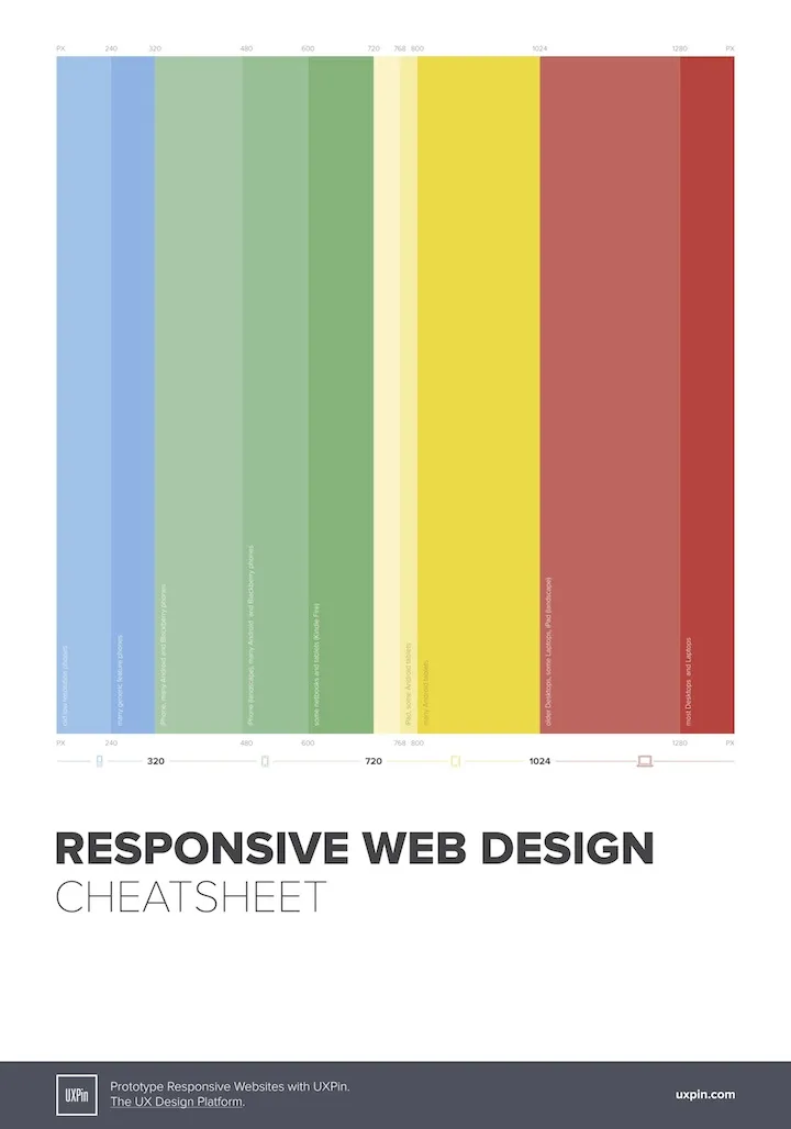
Using the responsive web design cheat sheet is very simple. Find the device you’re designing for on the chart and read what breakpoint dimensions it should have – and there you have it.
The poster is print-ready so you can even put it on your wall and never lose track of responsive dimensions again (or hang it in your office and make your teammates stop haunting you with questions about breakpoints).
Download the responsive web design cheat sheet (102 kB).