Choosing a Color Palette for Your Project
Somewhere between wireframing and prototyping, you need the right color selection for your design project. In some respects, your color palette matters just as much as the structure of your design. Given its importance, you don’t want to pick colors without careful consideration.
The following information should help you choose a color palette that makes your products more attractive and useful.
Did you pick the colors that you need for your UI? Then, let’s jump to design. Create advanced, interactive prototypes using UXPin. Improve your design process by prototyping user interfaces that feel and look like a real product. Make design consistency a no-brainer. Sign up for a trial.

Understanding color theory
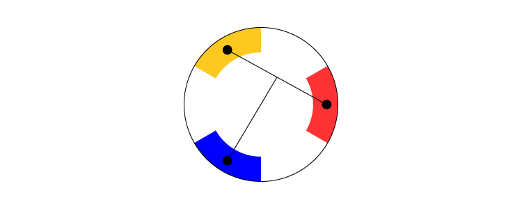
The color wheel has a deceptively simple look. At first glance, you might assume that it gives you little more than a selection of colors.
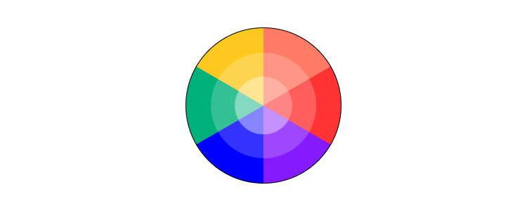
The more you study it, the more complex it becomes. You will discover that it gives you examples of:
- Cool and warm colors. Cool colors include blue, green, and purple. Warm colors include red, orange, and yellow.
- Value (the tint or shade of a color).
- Saturation (the color’s intensity).
More insight reveals nearly countless ways that you can use the color wheel to create color palettes.
Different types of color palettes
Some popular color palettes include:
- Analogous color schemes: Color palettes based on colors located next to each other on the color wheel

- Complementary color schemes: Color palettes based on colors at opposite sides of the color wheel.

- Double complementary color schemes: Similar to a complementary color scheme, except you use four points on the color wheel instead of two.
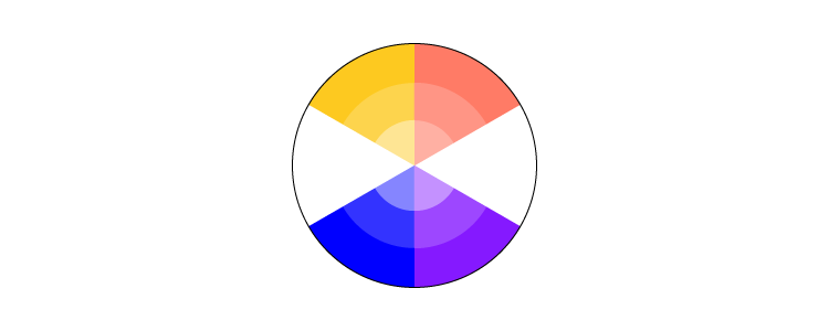
- Monochromatic color schemes: Color palettes that use variations of the same color.

- Split Complementary color schemes: Color palettes that start like a complementary color scheme, except you choose one color and the two colors next to its complementary color.
- Triadic Complementary color schemes: Color palettes that use triangles on the color wheel

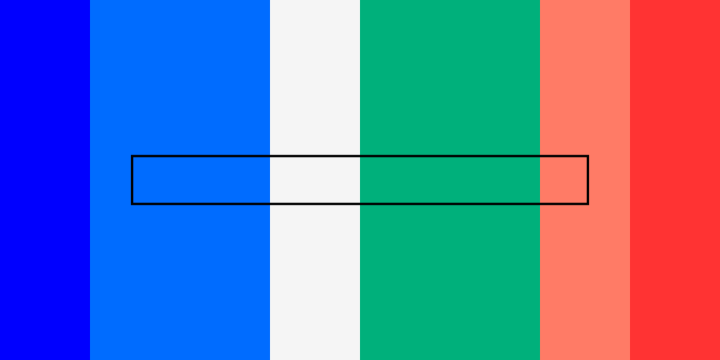
60-30-10 rule for color use
The 60-30-10 rule gives you an easy way to choose a color palette and stick to it. When done well, it can also help establish a brand’s identity.

With this rule, you use a primary color 60% of the time; a secondary color 30% of the time; and an accent color 10% of the time.
The rule works especially well in website design because you can keep your work clean and simple. For example, you could use your secondary color as a light background for your page.
Headers, subheads, and other critical aspects of the design can appear in the primary color. Finally, you can use the accent color to add a little panache to buttons or small pieces of text.
Trending color palettes
Trending color palettes change constantly. Don’t fall too deeply in love with one, because it will change before the year ends. Some color palette options expected to trend during 2021 include:
- Human skin tones.
- Super-saturated colors.
- Textured colors that look faded.
- Surreal, eye-popping color combinations.
Not every product wants a trendy color palette but rather goes for timeless brand colors. A client with an established brand, for example, might reject new color palettes that feel contradictory to the personality customers and clients already know.
Color tools and apps
Struggling to develop the perfect color palette for your design project? There’s plenty of online tools and apps can help you explore creative options that will make your product stand out from the pack no matter if you like pastel, retro, or whatever your color choices are.
Coolors
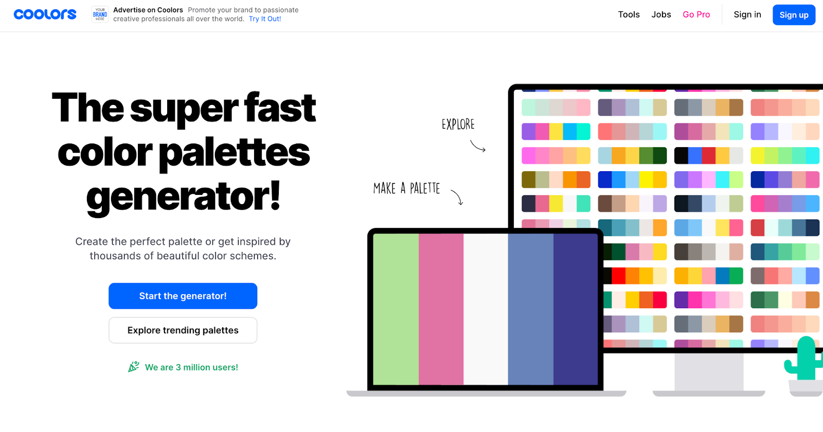
One of the most popular color scheme generators in recent years, Coolors has tools designed to help you choose colors for websites, smartphone apps, and other products.
Many people like Coolors because they can create free accounts that let them generate color schemes by sampling online images, entering hex codes, or exploring trending color palettes.
Material Colors
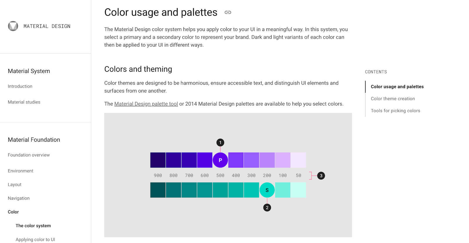
If you use Google’s Material Design, you might as well rely on the Material Design color system. The tool promises to help you use color in ways that add meaning to your UI.
Material Design has a wealth of tools that can use to create imaginative color combinations. It doesn’t assume that you’ve mastered the color wheel, though. If you feel lost, use Google’s tutorials and videos to learn more about how colors can influence the way people use your products.
Want to learn more about Material Design? Read An Introduction to Interactions With Material Design.
Color Supply
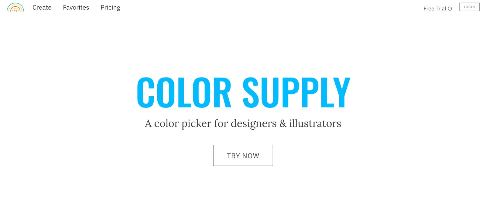
If you don’t have a lot of experience choosing color palettes, you need to spend some time playing with Color Supply.
When you open the tool, you see a basic color wheel. Beneath the color wheel, you can change the type of color palette that you want to use. Options include:
- Complementary
- Analogous
- Triad
- Slit-Complement
- Square
- Fresh
- Manga
It is quite straightforward and makes it easy for you to experiment with various color palettes.
Accessibility concerns for color blindness
Some people perceive visuals differently. Those with color blindness, for example, often struggle to identify green, red, blue, or yellow colors.
About 300 million people in the world live with some type of color blindness, so it makes sense to choose color palettes that they can experience vividly.
A tool like Venngage makes it easier to automatically use color palettes that are friendly for people with color blindness. You can also make designs easier to understand by using high-contrast colors, adding more textures to colors, and including more symbols that don’t rely on color for meaning.
There are other things you should pay attentiuon to when designing an accessible UI and UX of your product. Check them out here: Accessibility Guide for Designers.
You can also use a checklist as a handy resource whenever designing UI for web: Web Accessibility Checklist.
Improve brand consistency with color palettes in UXPin
No matter what color palette you choose for your next design, you need to establish consistency that helps users understand how the products work. If your color palette changes from page to page, visitors will feel very confused.
You also need to make sure all of your designers know what color palette they should use on each project. UXPin helps managers retain control of projects by creating design systems that limit the color palettes designers can access.
When you have a design system, you set up guardrails that let designers explore their creative impulses without going off-brand. A good design system can also streamline your process and limit the number of changes that you need to make before finishing the product.
Want to see how easy UXPin helps you build a design system that makes your design projects more successful? Sign up for a free trial today to test UXPin’s features. You don’t have to provide your credit card information, so you get a no-obligation way to experience the best designing and prototyping tool for teams.