We don’t do well with uncertainty.
When things go wrong, we want to know why as quickly and easily (but maybe not truthfully) as possible. But when technology is thrown into the mix, the problems are more complex. Our perceptions change. When something goes wrong with a user interface, the questions don’t always have easy answers.
It’s the designer’s job to connect and empathize with the user, to teach them the language of design, to put MVPs in their hand, test, talk, and arrive at a solution.
Designers aren’t there just to make digital products beautiful, but to make people feel good when they use them— especially when things go wrong. Let me explain a situation from my own life in which the design failed, but I ended up blaming myself instead of the website.
How I paid the government to make me feel stupid
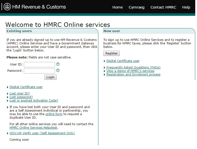
A few years ago, when I was working as a freelancer, I used the UK government’s web interface to pay my taxes. The term “used” is employed rather loosely here, as most of my time involved clicking everything that might have applied to me until I saw some words that looked vaguely familiar, and then running with it to the best of my ability, hoping an angry letter wouldn’t arrive at my door a few weeks later.
Throughout this entire process (which was advertised as quick and simple), I was made to feel stupid for not being able to navigate the interface, with robotic language and a journey in which I always ended up where I started. It wasn’t my fault and yet, for every error, I blamed myself.
I felt as though, somehow, I should have been able to figure it out.
Retrospectively, I understand that the responsibility is not mine. An online web service that collects taxes should pride itself on simplicity and ease of use. I should always know where I am, how I got there, why I got there, and how to go back. My feeling incapable, lost, and insecure was a failure of the interface— it overwhelmed me, and offered no help.
It didn’t have to be beautiful; you don’t need to make taxes sexy or perfectly kerned, but you do need to ensure that users feel taken care of at every stage of the process. After all, I’m trying my hardest to give you my hard-earned money— surely, this is the time to make someone feel safe and secure. Instead, I felt woefully underprepared, as if I should have studied how to use the interface before using it.
So who should we blame for bad UX?
When it comes to figuring out who is at fault for the problem and who should fix it — you would think the answer was easy: it’s the interface designer’s fault, so that person must fix it. Surprisingly, though, users (like me) tend to blame themselves. I didn’t create the interface and had very little input. So why the self-blame?
Don Norman explains this concept of blame very well in The Design of Everyday Things. He describes how susceptible we are to blaming ourselves rather than designers or developers for interface failures, and why that behaviour is wrong. Trying to restate his work here would be silly (if you haven’t read the book, you definitely should), but the psychological processes are complex, contradictory, and fascinating.
We hate uncertainty, and we’ll do anything to escape it, as quickly as possible— even if it means lying to ourselves.
What’s happening in the user’s mind?
Our brains play tricks on us to make the world easier and more pleasant to navigate.
One of these tricks, the self-serving bias, leads us to attribute negative outcomes to the outside world, for the sake of our self-esteem. Conveniently enough, this same bias makes us think that anything good that happens is a result of our own personality. If we fail a test, then the test was too hard. But if we ace the test, then surely it’s because we studied hard. The self-serving bias holds true in employment, in sports, in almost anything — except computers and their applications.

In certain human-computer situations, users can sometimes show a tendency to attribute success to the computer and blame themselves for a failure, when they should do the exact opposite. This is complicated by many factors — age, degree of control, and even gender— but the “I’m bad at technology,” adage continues to persist.
It’s so common that it’s accepted as an excuse without question. Instead of allowing themselves to say, “this isn’t intuitive,” users may feel guilty, taking responsibility for that failure when the fault lies with the designer. “It isn’t intuitive,” isn’t a neat solution that removes the uncertainty, but blame is final.
It’s not you, it’s the designer.
Let’s break down exactly why this self-blame still happens:
1. Computers are still ambiguous to some users.
People have conceptual models (mental simulations) of how computers work that aren’t necessarily true, but they’re good enough. That is, until something goes wrong.
If your user is confused by the error, and it doesn’t fit anywhere within their conceptual model, that’s stressful. The path of least resistance is to blame themselves. It’s faster than trying to comprehend how the application works, and how they arrived there. They’re a user, after all, not a QA tester.
2. We are susceptible to the aesthetic-usability effect.
If it’s pretty, we must be able to use it and if we can’t, it’s our fault. Ello is a recent example: a beautiful, minimal interface that turns out to be a UX nightmare due to inconsistent design, unnecessary animations, and bugs.
3. Task-selection bias.
If we tell the user to perform a task, then they believe that they should be able to do it. If they can’t they feel guilty and blame themselves.
4. Norman’s concept of taught helplessness.
Because the user fails at one technological task, they now think they fail at anything related to technology. Because the user may also believe that they can’t offer a concrete solution to the problem (“Adjust the line-height for better readability,” etc.), it’s just easier to resort to “I’m bad at technology”. It removes the uncertainty and stress faster, but it also stops them from connecting with your product.
If we want to make great digital products, we can’t allow users to blame themselves. It will only reinforce the idea that designers (and developers) should be able to read their minds, and prevents the user from realizing that they are one of the most important steps to a great user interface.
Designers can’t work in isolation. Creating beautiful, usable, intuitive interfaces is now a collaborative process, with the end user at its core.
UCD, MVP, UAT: Acronym all the solutions!
So what can we do to prevent this?
As interface and product designers, we need to humanize our process. After all, we’re building interfaces for people, and they might not realize that it’s actually someone’s job to solve their problems and make their lives better.
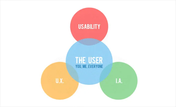
- User-centered design is now an expectation in the industry. We research, we test, we build, we create— all with the user’s goal in mind. Make sure your user knows what an integral part they play, and that failures are okay and even desired: learn their language and teach them ours, and you will gain invaluable feedback.
- The MVP: As discussed in The Guide to Minimum Viable Products, we must put an MVP in their hands sooner rather than later. This MVP may not even be a physical product or website. It could be a drawing, a prototype, or a concierge service— it doesn’t matter. The sooner a user can interact with what you’ve made, the sooner they can understand that design is an iterative process, not telepathy.
- Test early, test often: Like it’s emphasized in The Guide to Usability Testing, don’t wait until the high-fidelity mockups are finished. Hell hath no fury like a developer told the navigation is changing late in the game. So test as early as possible. Draw sketches. Then draw some more sketches. Show them to users. Make lots of wireframes. Show them to users too. Get them involved, and everyone will have that much more confidence.
- …but test with purpose: Those drawings and wireframes and prototypes are great, but we need to define hypotheses first, and make sure we ask the right questions to test them. If they’re right, we learn something. If they’re not, we still learn something, but it’s up to us to ask the right questions.
- Educate and empathize: If the user is giving you the “wrong feedback,” maybe you’re asking the wrong question. Like it says in the Usability Testing Kit, ensure that they understand that this product is for them, and if it doesn’t work for them, then they haven’t failed— we have. Remove the ‘black box’ mystery of computers, and show them that it’s okay if things go wrong— you’re there to fix it.
- User Acceptance Testing (UAT): Not to be confused with user testing, UAT ensures that the technical aspects of the interface are done well— you know that the user wants to complete a certain task, but can they actually do so? Find and eradicate the errors before the user sees them.
- Don’t get emotionally attached: If we spend endless hours adjusting kerning and touching up stock images, we are far less inclined to make the necessary font change when a user has trouble reading an instruction. Focus on making something usable and aesthetics will follow naturally.
- Be ready to change: If all this testing shows that you’ve made a misstep, don’t panic. Shift focus, repurpose what you built, or start from scratch. You’ve found a new direction, a new goal, a new spark— run with it.
This transparency is the key to erasing the notion that computers and their applications require heroic intervention when something goes wrong.
It’s not the user’s job to get it right, but their feedback is the secret ingredient to making an interface as intuitive as possible. Attach yourself only to the problem that needs solving, not the design.
Design is a game of confidence
Design isn’t about pushing pixels. It’s about advocacy. As designers, we can make it clear that it’s not about the user understanding technology, but about the technology (and those who create it) understanding them. As soon as we allow our users to blame themselves for our failings, we lose the opportunity to make something truly brilliant.
As Mike Monteiro says, “[we] are in the confidence game.”

We are there to offer confidence to both our clients and our users— we’re in the service industry, whether we like it or not. We have to explain to our users that we are going to create something to fit their needs and solve their problems and that if we don’t, they’re not at fault. All they have in front of them is an interface, the manifestation of our work, and if that doesn’t give them what they need, then we have failed.
Great digital products, after all, are a result of hard work, change, and understanding of both the problem and the user. This isn’t easy— if we expect it to be, then we shouldn’t be designers.
To learn more about best practices in UI and UX, download the free e-book Web UI Best Practices. The book analyzes examples from 33 companies and includes advice from experts like Jared Spool, Jeff Sauros, Luke Wroblewski, and others.