The basic homepage design is so 2012. The supposed magic formula of 10 elements to include for a successful home page isn’t enough anymore for a simple reason — it’s too formulaic. And that can create for a boring homepage that’ll drive users away. That’s not to say those page elements don’t have function — they are still important — but they are lacking what users crave, human interactions along with a delightful surprise or two.
So the list is changing. Don’t worry, we can still boil the requirements for a successful modern homepage down to 10 things in this post. And you might be surprised how this list has evolved.
1. Go Responsive
We consume more media on our phones than on our desktop. In the US alone, more than 75 percent of people use their phones to access the internet. So it almost goes without saying: Your website needs to be responsive, meaning that it works on a variety of screen sizes and resolutions. Sadly, there are still a lot of sites out there that are not living on a responsive framework.
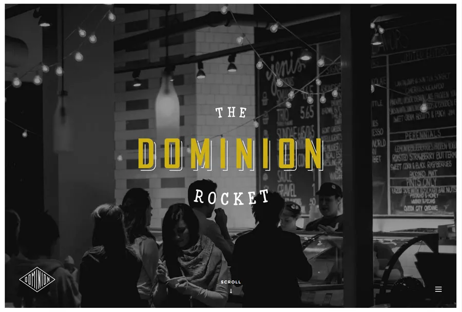
Photo credit: Dominion Rocket
Responsive isn’t just a must have because users expect it. Having a responsive site can affect your bottom line. In his excellent Inc article, John Boitnott points to a 2015 study that shows a responsive site sees a 10.9 percent increase in conversions year after year. Boitnott also cites how O’Neill clothing saw a 65.71 percent conversion increase on iPhone devices and a 497.32 percent increase on Android devices three weeks after going responsive.
If you’re going responsive, take into account load times. Your homepage needs to load lighting fast, or else you’ll endanger your conversion rates. Consider whether loading an animation makes sense for a mobile experience. Some responsive frameworks allow you to choose what type of content you want to serve up on what device. That means you can have an animation load on desktop only then have an image load in its place on a mobile device. This will save users the headache of waiting for a heavy animation file to load.
You need to quickly entice users with a great first impression — meaning that it has to work on mobile just as well as on desktop and not take an android’s eternity to load.
2. Win Them Over With Awesome Visual(s)
Regardless of what you include on every other page, the homepage needs to have some visual appeal. Visuals can entice your users to use your site, as we described in our free e-book, Web UI Design for the Human Eye. And you’ll also want interesting visuals on your other pages.
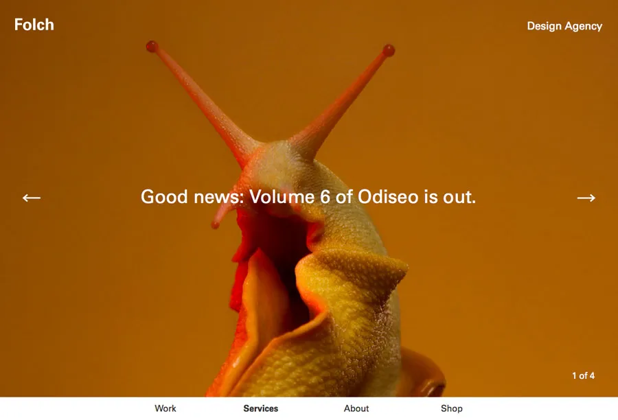
Photo credit: Folchstudio
So what do we mean with the term “visual”? Well, this can be created in a number of ways, through the use of the following:
- Photo
- Illustration
- Video
- Animation
- Text
While what makes a visual awesome can be a little more difficult to define, there are a few things great visuals have in common.
- Is unique and convey emotion and impact
- Tells your brand or company story
- Is “readable” at a glance
- Is technically high-quality so that it renders well for all users
- Is integrated into the design
Most of all, however, we place our faith in things that are visually appealing. If a site isn’t aesthetically pleasing, we’re likely not to trust it at all.
3. Add Some Color
Some more recent design trends have emphasized black and white frameworks and those with an overall lack of color. But some color — even just small touches — can take those concepts to the next level. Color creates a sense of immediate place and an emotional tie. It helps establish visual hierarchy and cues users so they know how to interact with the site.
Not sure where to start? Bright, vibrant hues work well to provide contrast in black and white aesthetic frameworks. These colors also offer an eye-popping palette of their own.
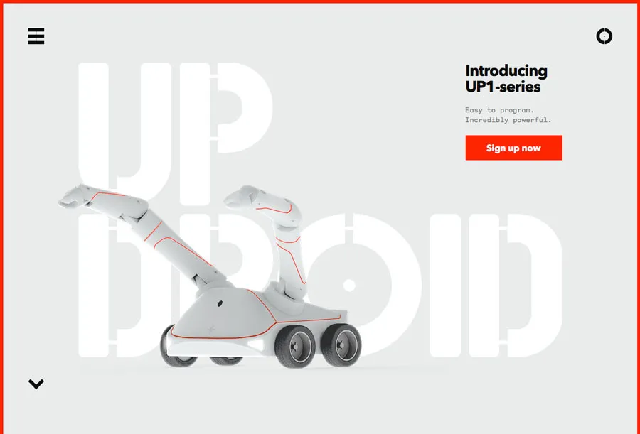
Photo Credit: Up Droid
Up Droid is a minimally-designed site without a lot of color. This makes the red button, red border and red lines on the actual robot really stand out, drawing the eye across each of these elements. Note how the red border around three sides of the homepage encourage you to look down and scroll deeper into the site. The designer used a simple color outline to create hierarchy, general visual interest and provide instruction.
4. Create an Identity
The homepage is a user’s first glance into what your company or brand is all about. It’s the place users go to if they happen on your site by chance and want to know more. Make each of these interactions feel personable to help sell what you do and who you are.
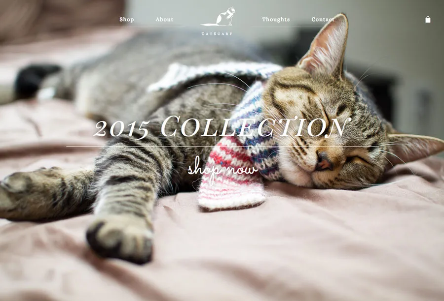
Photo credit: Catscarf
It takes brand personality. That’s everything from visuals to language to tone and voice. Personalization can come in the form of geolocation tools, logins and cookies that remember users and speaking to users like a person to a person through copy.
Brand is storytelling. You’re communicating your story to your users with all those things. But the one thing to remember is to be consistent across your brand. If your site is littered with typos or a mismatch of visual styles, you’ll be communicating to users that you don’t care about quality. Consistency is key and helps to build trust with your users.
Those who identify with and trust your brand will be the ones who’ll engage with your site again and again.
5. Have an Element of Surprise (Or Desire)
Nothing beats a homepage that does something a little unexpected (or makes me think I can’t live without an item or bit of information). While you probably can’t do both of these things, try to do one or the other.
Your element of surprise is what makes your site unique, use that to your advantage in the design of the homepage. Focus on it. Design around it.
One caveat, however. As we point out in our free e-book, Demystifying Delightful Interaction Design, surprises need substance. They must be measured against the usability.
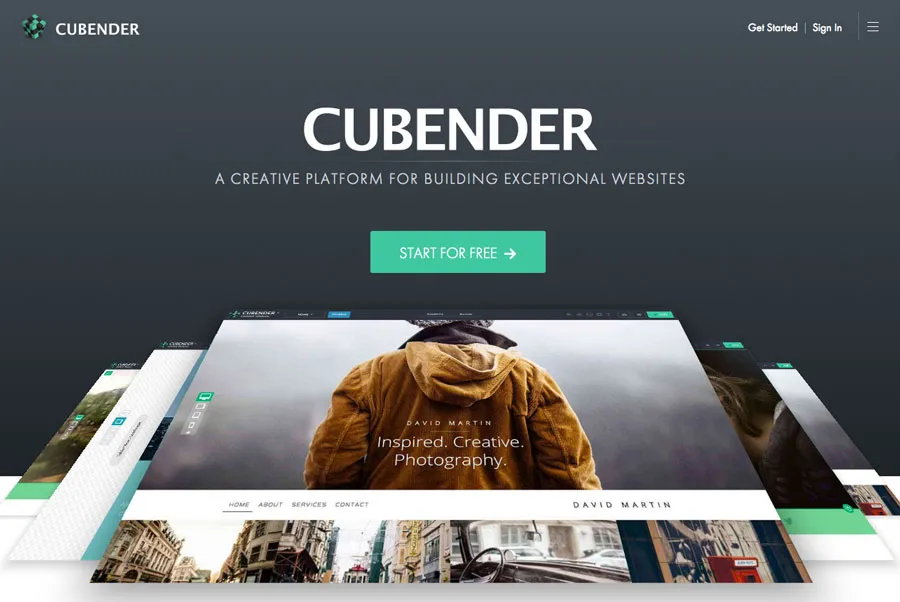
Photo credit: Cubender
The design of Cubender contains an element of design surprise in the orientation of screengrabs to showcase its product. The site also does a good job of creating desire because the product looks its best. If you are in the market for a website, it is likely you will click to learn more (and note how they tell you it’s free).
However, the Cubender doesn’t sacrifice usability for its delightful surprises. The site is still relatively easy to navigate, the copy is clear and the calls-to-action clearly prominent.
You want to entertain users. You want to captivate their attention by giving them a surprise or two. But don’t delight for delight’s sake, ensure that your site is still usable and that the surprises don’t hinder that.
6. Bring Things to Life With Animations
Animation is without a doubt the hotness in 2015. From full-screen animations to parallax scrolling to simple hover effects, a little moving magic is must-have. Just don’t go overboard — pick an animated element and focus on that.
Animations can be used as a means of storytelling, reveal information or communicate how something works, as we discuss in the e-book Interaction Design and Complex Animations.
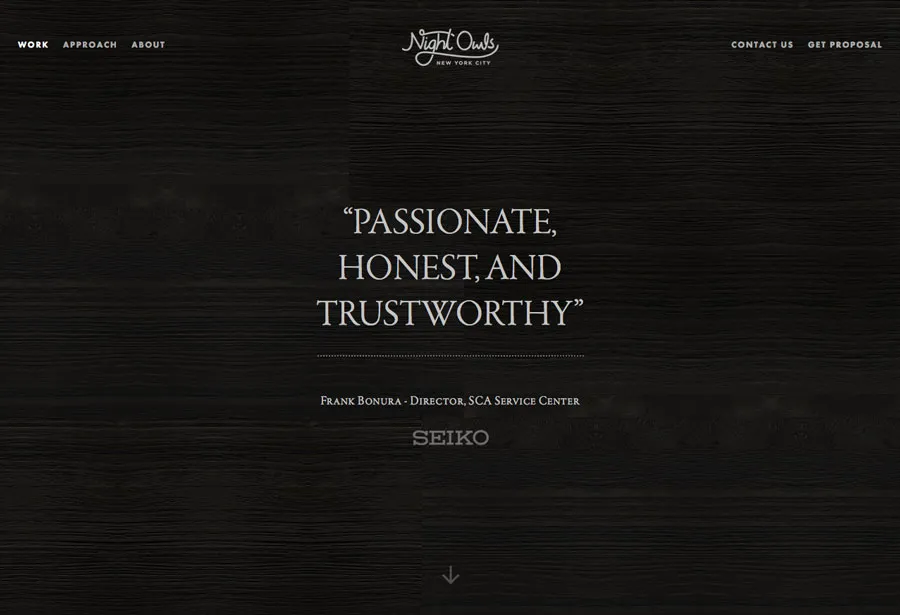
Photo credit: Night Owl Interactive
For sites that lend themselves to animation easily, a video or animated hero header can be an excellent way to draw users, such as Night Owls (above). The hero header uses a different type of approach as well, with a hero-style header that uses scrolling testimonials to get the attention. Consider a more functional animated element for sites where this type of solution isn’t a fit.
Longer single-page sites can benefit from parallax scrolling to add interest and keep users engaged with content and almost any website framework can add an unexpected element to a button or link with an animated effect. (Some of the most effective animated buttons include those that expand or change color on hover or provide instruction when it comes to filling out a form or performing an action.)
Animation’s are another way to add visual interest to a site and, like with delightful interactions, must be used to enhance usability not hamper it.
7. Ensure Navigation is Intuitive
The days of the mega expanded navigation are dwindling. More streamlined (and sometimes hidden) navigation is more common, from hamburger menus to navigation bars with only a handful of site links.
When using the less-is-more approach to navigation, the trick is to be clear and simple with labeling. Don’t overthink it or get too cutesy. Each navigation element should clearly state what comes next: Contact, About, Shop, Tutorial, Support, etc.
The other consideration is linking through navigation that does not look like traditional navigation at all from the homepage. What if each link on the homepage is goes to something that would have traditionally been a navigation element? Do you need navigation on the homepage anymore? Could you then push more traditional navigation to secondary pages (or at least “hide” it)?
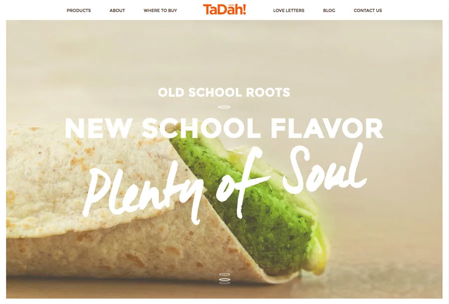
Photo credit: TaDah!
TaDah! Does a good job of integrating the brand’s fun tone of voice with simple navigation. Each label is understandable from “Products” and “About” to “Love Letters.” The other great thing this site does is keep the navigation streamlined when it comes to depth and it’s sticky, so it does not get lost in what is a longer scrolling site. The navigation elements are also included as content blocks near the bottom of the scroll to help you get deeper into the site.
8. Give Something for Me To Do
For users, websites are often a “me” experience. What does this site offer me? What will I get from it? What is there for me to do here?
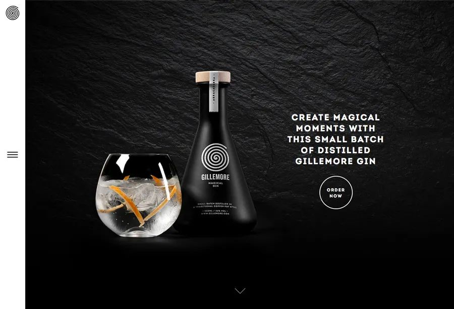
Photo credit: Gillemore
Make it easy for users to find the answer by providing users with something to do on your site. (You do have a homepage for a reason — make it abundantly clear.)
In 2006, Derek Powazek outlined goals for A List Apart that apply to pretty much any website. While a lot has changed about how we design and build websites, his goals are very much applicable to today’s homepage design.
- Tell users what you do and make a solid first impression
- Provide a starting point for new or returning users
- Show what’s new (and give users a way to access it)
Now let’s take that to a practical level. What can you give users to do when they come to your site? The answer can vary by industry, but there are a few commonalities. The question: Does your homepage provide any of these experiences?
- Get basic business information, such as hours or location
- Call, email or contact a business
- Download an app or information
- Find links to social media
- Play a video or look at other media
Another way to think of it is that you’re providing the who, what, where, when and how for your users.
9. Provide Clear Contact Information or a Call to Action
You want users to find you, right? Contact information should be easy to find. Put email links, tappable (and callable) phone numbers and any other relevant information in a consistent location. This might also include a physical address or staff bios, which can lend credibility to your company.
Most of this information can easily live in the website footer. It is recommended to include it in the homepage structure as well.
Sometimes it might be more important for your site to focus on a call-to-action on the homepage. This is common especially for pages that are previewing something that will launch later, such as an app, or trying go get a user to provide personal information, such as an email. When a call-to-action is the prominent theme, make sure to follow up with each user with some contact information. (It will likely be in the footer of the email you send them after signing up for something.)
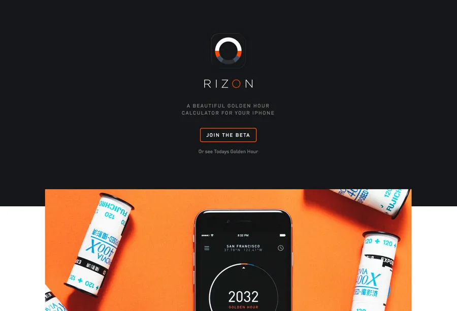
Photo credit: Rizon App
The site for the Rizon mobile app focuses on a call-to-action with a “Join the Beta” button. The button is easy to see and the form is easy to fill out — it only requires an email address. Scroll to the bottom of the page and there’s contact information for the developers so users can connect with them on social media. Both the CTA and contact information are designed to be part of the overall website and are not obstructive or in the way, yet provide valuable function.
As we said in number 8, you’ll want to give your users something to do. Well, on top of that, you’ll want to give them something to act on.
10. Keep It Simple
Now take all of the above elements and simplify them. (Seriously.)

Photo credit: Ultimouomo.com
While it may sound like a daunting task, it’s achievable. Think about all of the websites you love. Now look at them closely and you’ll see that many of these element exist within their frameworks.
The best design is not something that screams at you. It’s a subtle combination of visuals, usability and even luck. Don’t overthink it. Keep it simple. Functional. Beautiful.
Takeaways
All of these website needs and concepts come back to a single idea. Users want to make their digital interactions feel as human as possible. Each element and aspect of the design must contribute to an overall human connection between the website or interface and the user.
While trends may help dictate some of the techniques, much of what is needed on a website homepage has not changed much during the internet’s rather short history. Combining good visuals with technology and usability will always be in style.
To learn more practical tips and tricks, check out our free e-book, Web UI Design Best Practices. We dive deeper into an explanation of visual design, interface design and UX design, analyzing more than 33 examples from companies such as LivingSocial and Spotify.