Ever wondered how to design the perfect email template for any device? We’ve got you covered with this practical piece that explains a mobile-first approach to email design.
If you’re a smartphone user, you’ve probably experienced the frustration of opening an HTML email on your device and having one or more of the following things happen:
- An overlapping mess of graphics, text and icons greet you and you immediately think “unsubscribe” and/or “delete.”
- The text is so tiny, you either zoom way in (and then you have to drag left, right, up and down to see the rest of the text) OR you get your reading glasses.
- The tap targets are way too small for your giant fingers.
- The spacing between the tap targets is unconscionable so when you try to tap one thing, you end up tapping three things.
So how do we, as UX professionals, fix problems like these in our emails? How confident are we that it’s even worth our time to address HTML email problems on smartphones? Case in point: in the company’s 2014 year-end review of email client market share report, Litmus reported that email opens on mobile devices rose steadily from 8% in 2011 to 48% in 2014.
The math’s pretty easy on that one — a whopping 500% increase!
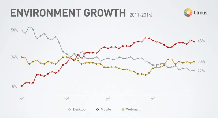
Photo credit: Litmus
As user experience designers, we’ve all seen how Responsive Web Design (RWD) techniques and a “mobile-first” approach have modernized websites over the last four years. But many of us are still in the dark about how to apply those principles to HTML email design. With more people than ever opening emails on their mobile devices, it’s time that we take a critical look at our design approach and examine the process for creating great email experiences, regardless of screen size.
Shorten the Responsive Email Learning Curve
If you are starting from square one when it comes to designing responsive HTML email layouts, you can find a vast amount of resources online that range from technical email design references to sweeping guides on mobile fundamentals.
It’s definitely worth your time to look at different approaches to designing mobile-friendly emails, including the media query approach as well as the single-column approach.
Not sure where to start when it comes to actually coding your HTML email layout? Don’t worry about it. You can also download 7 responsive email templates (and their PSDs) for free.
And finally, check out the awesome Responsive Design Cheatsheet that all email designers should print out immediately and tape on the wall.
Identify the HTML Email Layout that Achieves your Goals
What goals do you have for your HTML email? Maybe you want to maximize click-throughs on a “Learn More” button? Or, perhaps you are pushing for a greater social media following via the Facebook and Twitter tap targets.
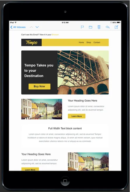
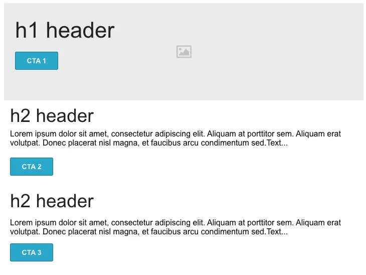
Whatever the case, you want to identify the layout that will help you achieve your business goals. For example, if you are looking for a 1:2 column newsletter layout, here’s a responsive HTML email design with a hero image, navigation, ample white space and touch-friendly CTAs previewed in an iPad Mini viewport.
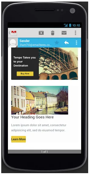
Here’s the same layout in a previewer for the Gmail app on an Android device.
So, what kind of layout will help you achieve your business goals? As a UX professional, an important part of the process is to investigate the type of content you are sending to your audience and the actions you would ideally like them to take.
Build a Low-Fidelity Responsive Email Prototype
OK, so what’s next?
Try building a low-fidelity responsive prototype of your HTML email that includes breakpoints for the screen sizes and devices you’re supporting. If you cocked your head after reading that, it’s totally understandable. Let’s break it down.
- A wireframe helps you visualize the hierarchy of your email layout. You put in the basic building blocks of your email without actually putting in content or pretty visuals. Think grayscale boxes with a sprinkling of text placeholders.
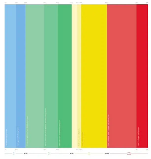
- By adding responsive breakpoints to your HTML email wireframes, you can build an interactive prototype that simulates how your user will see the email on his or her iPhone, Android mobile device, tablet and desktop.
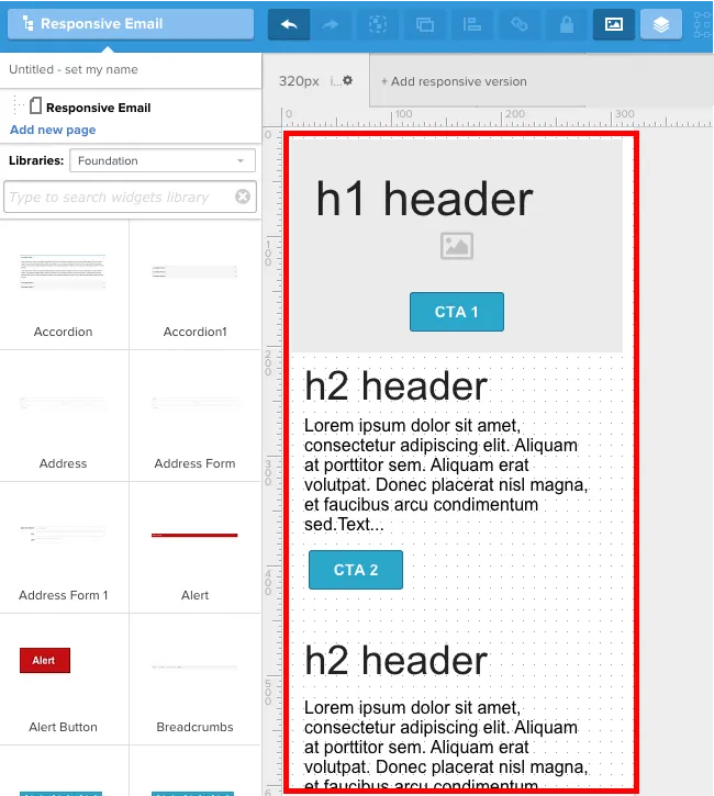
Step 1: Create a Wireframe for Mobile View
Because we’re taking a mobile-first approach to responsive email design, you’ll want to start by creating a wireframe for your mobile view. UXPin makes this super easy by having pre-made spaces and breakpoints for mobile device spaces.
If you haven’t already, go ahead and create a free account. Feel free to follow along by checking the preview project I’ll describe below. For the purposes of this tutorial, we’ll use Greeked out content—however, you should always use real content (or at least rough content) since that’s what your users care about most.
Start by creating a new wireframe. In the tabs area, click “+Add responsive version” (you can ignore the Default tab).
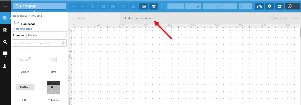
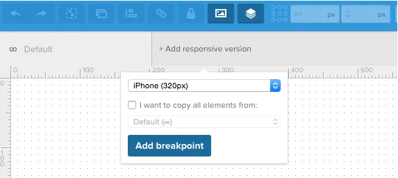
When presented with the option to choose a preset, select “iPhone (320px)” (mobile-first, remember?). Once selected, uncheck the checkbox for “I want to copy all elements from:” because we don’t need it at the moment.
In the new 320px canvas, drag and drop your email elements. For example, you can put a hero image, some headings and a few text elements in place for the mobile-friendly email view. Customize the elements so they fit the breakpoint.
That’s our first design using the breakpoint for the responsive HTML email layout. Next, we’ll set up additional breakpoints to simulate email interactions for users on tablets and desktops.
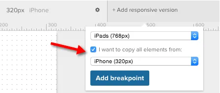
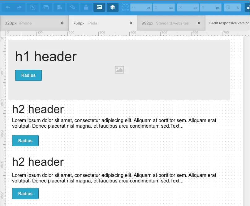
Step 2: Resize Wireframes for Tablet and Desktop Views
Now that you have the wireframe of your mobile HTML view set up, let’s add wireframes for both the tablet and standard website views.
Again, click “+Add responsive version” in the tabs area and select “iPads (768px)” or “Standard Websites (992px)” from the present drop-down list. Time-saving tip: If you check the checkbox for “I want to copy all elements from:” and select the initial breakpoint (“iPhone 320px”), all elements from that wireframe will be copied to your new wireframe and breakpoint.
Once you add your tablet and website canvases, you can easily rearrange / resize your HTML email elements for that view.

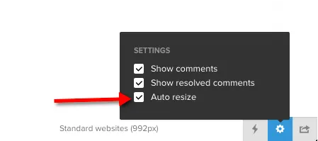
Step 3: Preview Prototype
OK, now you have all the building blocks in place. You have your HTML email wireframes for mobile view, tablet view and desktop view. Let’s check out the simulation! In UXPin, click the “Simulation” button.
Now, you want to make sure that you can simulate how your design will adapt to different viewports (e.g. mobile vs tablet vs desktop). To do so, click the Settings icon and check the option for “Auto Resize” (lower right-hand corner of your screen when previewing).
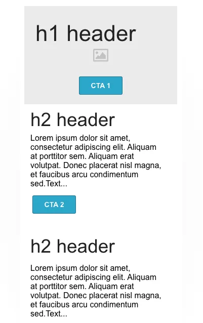
Nice! Let’s test it out. We’re able to simulate our HTML email’s iPhone 320px breakpoint:
A tablet’s 768px breakpoint:
And a desktop’s 992px breakpoint:
Summing It Up
OK, so you may have skimmed the title of the article and then skipped down to this section (CliffsNotes, right?) or you read the entire article and are eagerly awaiting the summary.
In short, users are viewing emails on their mobile devices a lot more than they used to, which means designers should consider Responsive Web Design techniques and “mobile-first” principles when creating their HTML email layouts.
As a UX professional, take a critical look at your approach to HTML email layouts and follow the steps below to ensure great email experiences, regardless of screen size.
- Educate yourself on designing responsive emails
- Identify the HTML email layout that achieves your goals
- Build a Low-Fidelity responsive email prototype
Feel free to practice what you’ve just learned in UXPin with a free trial.