8 Years on the Design Tools Market, 5 Lessons Learned

UXPin’s 8th birthday this month brought on some deeply nostalgic memories.

Eight years on the design tools market has given us a pretty broad perspective. We’ve seen trends come and go, big companies enter the market and leave, companies with lots of capital doing nearly nothing and small players out–innovating everyone. One could write endlessly about it. I don’t want to bore you, so instead I’ve boiled it down to five specific lessons.

1. Being right is not enough. You have to be right at the right time.

Timing is everything. We’ve experienced it all — we’ve been too early, too late and exactly on time. Only the last group of events strongly benefits business.

Examples of being too early

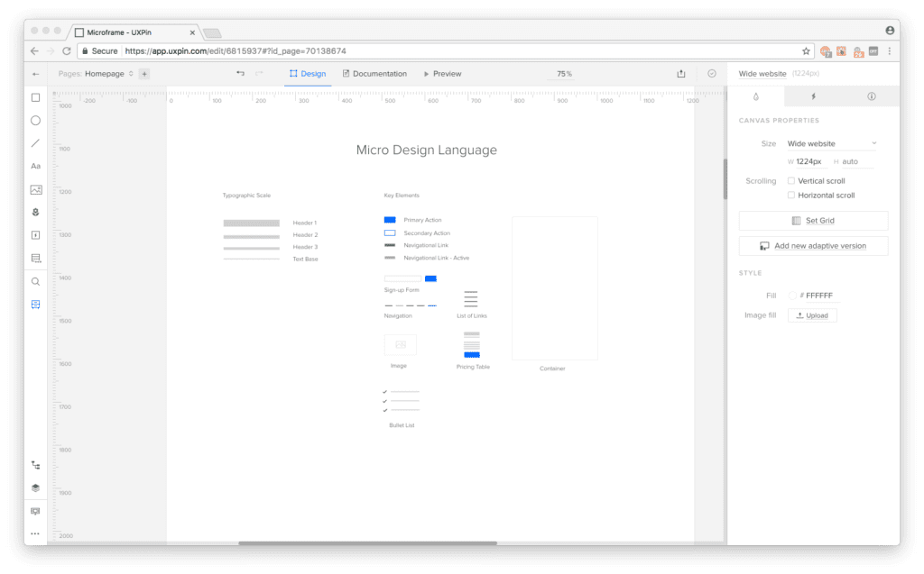
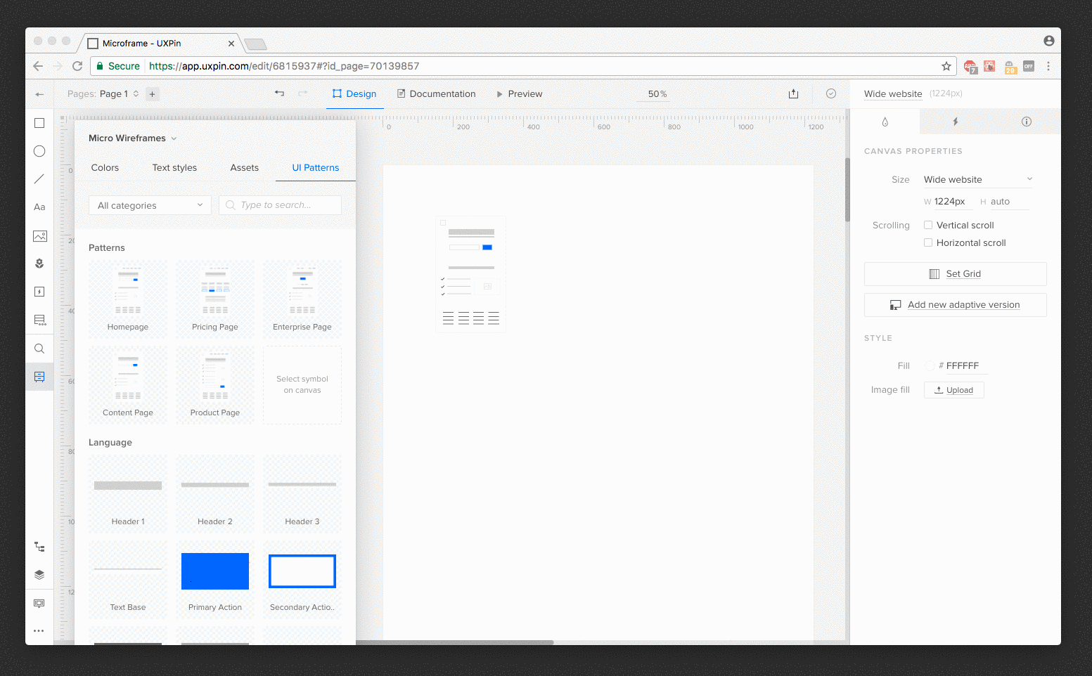
The first version of UXPin had a flawless real–time collaboration (multiple people editing one design mockup simultaneously. We called it multiplayer design) in… 2011. No-one really cared about it for the first 5 years of UXPin. Only with the growth of design organizations and the expansion of remote work did real–time collaboration become truly important.

Eventually we stopped believing in multiplayer design; and this feature completely disappeared from our communication (but not from our product!). Then, a competitor announced it like it was new. Not an unrecoverable loss, but still a loss.

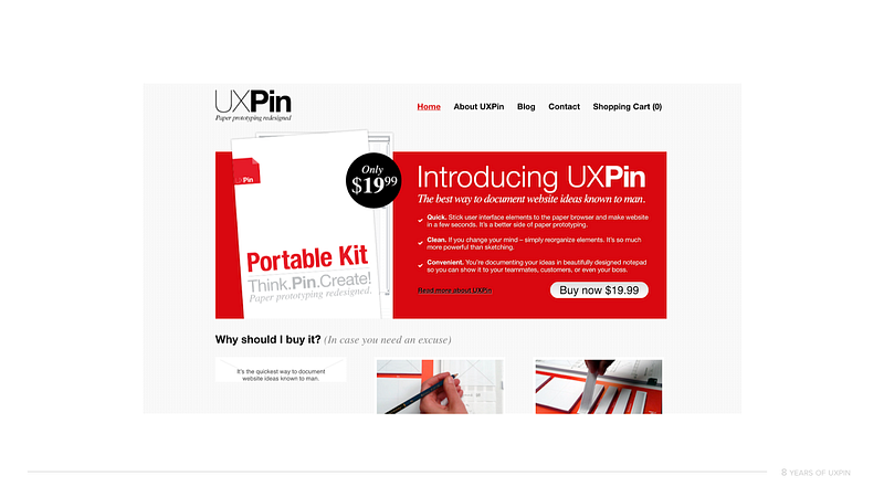
Another feature of our 2011 UXPin (since cancelled) was the ability to turn paper prototypes into… HTML–based prototypes. Yes. We had a technology able to transform paper prototypes into HTML… in 2011.

UXPin in early 2012.


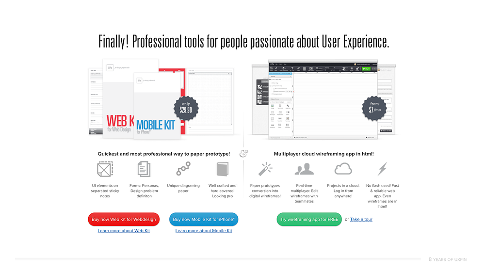
It was a powerful marketing machine, but with little real–life usage, we ultimately killed it in 2013. Now, 7 years later, similar products are reappearing on the market as an applauded innovation; it seems that folks are more willing to experiment with its value in real design processes. We were way, way too early.

Examples of being spot on

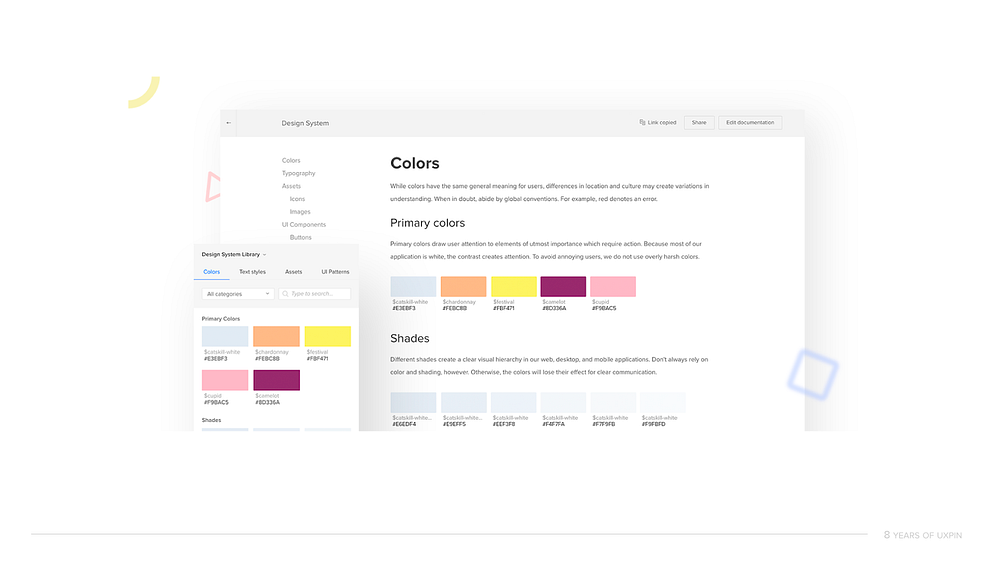
Back in 2015, interest grew in solutions to help organizations scale design processes without making the whole system more disjointed. The market of tools seemed almost completely empty, and customers were desperately trying to build their own solutions. We moved fast and announced Design Systems as part of UXPin before significant competitors could. First mover advantage helped us establish a solid presence on the enterprise market.

UXPin Design Systems. We were right on time!


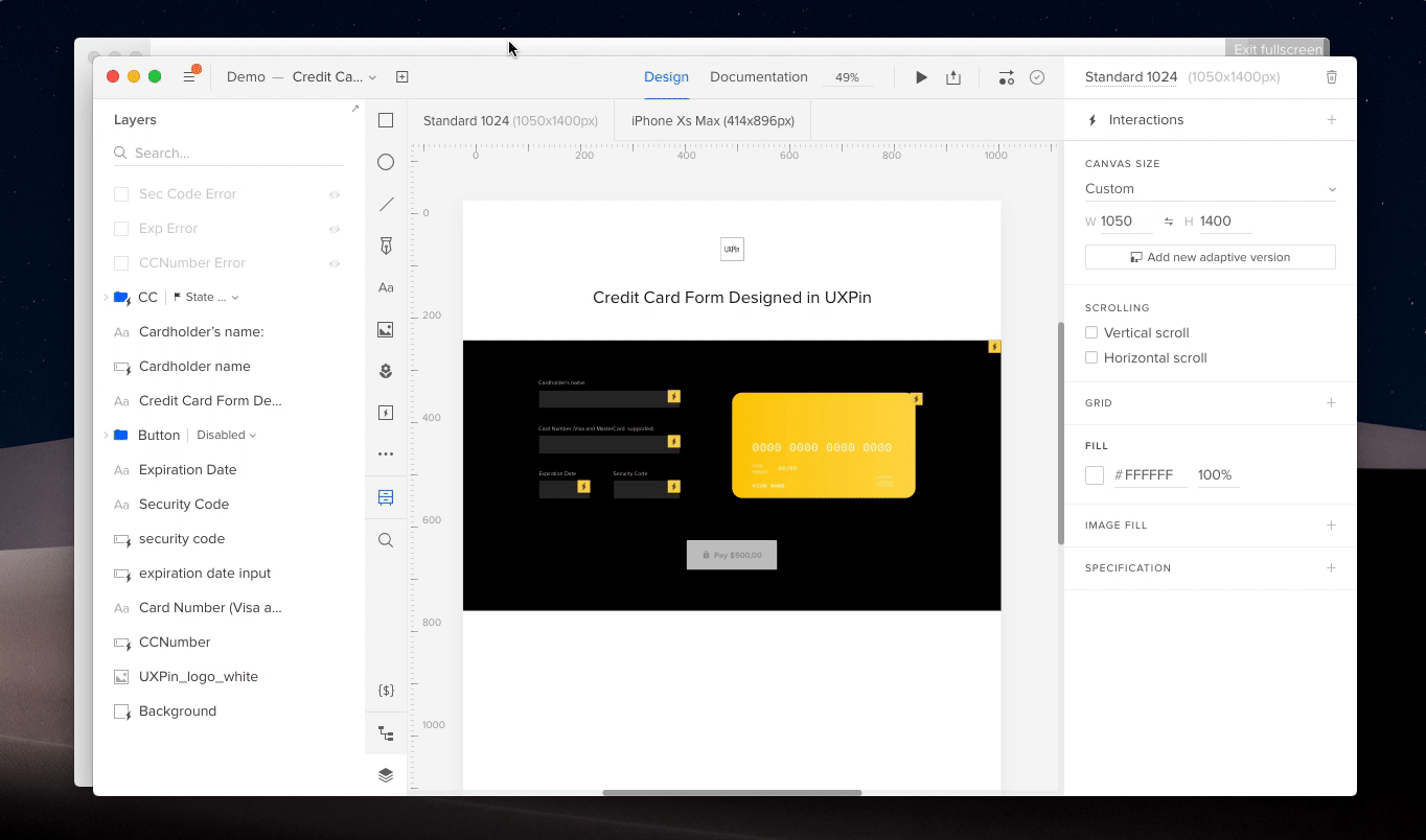
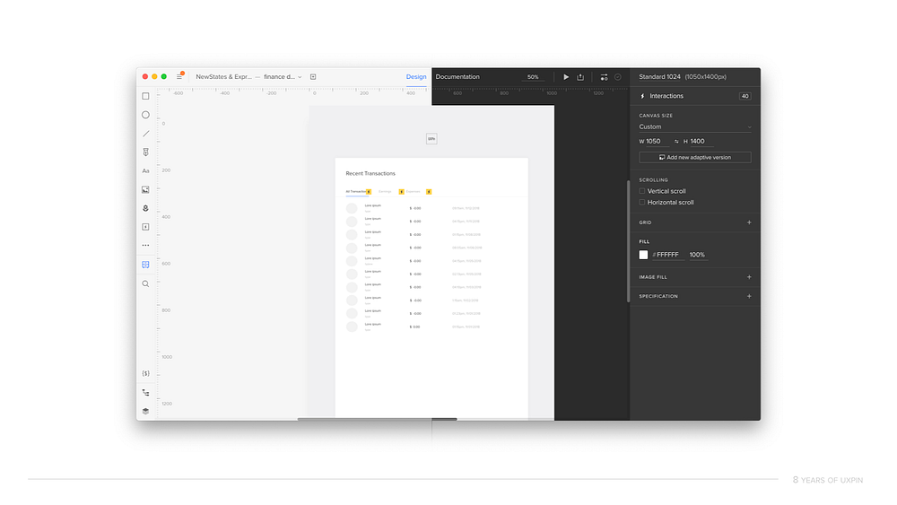
Additionally, just two weeks ago, we launched “expressions”, a feature that exposes JavaScript methods in a design tool in a friendly way — similar to Excel formulas. Expressions allow designers to create interactive prototypes with accurate simulations of, for example, form validation, eCommerce shopping carts or sign–up/sign–in flow… basically anything that is possible on the web can be accurately prototyped in UXPin.

Prototype created entirely in UXPin. Real validation and recognition of type of a credit card.


A few years ago this feature would have been rejected in the divisive discussion, “Should designers code?” Nothing like that happened after the launch of expressions. On the contrary — the feedback was enthusiastic and we’re seeing amazing traction among both coding and non–coding designers.

2. Only achieving critical mass of value lets you escape the market’s gravity.

Sometimes it feels like a new design tool emerges every other week. After a couple of days of excitement on the market, the tool starts to fade away. 12 to 18 months later? No signs of any development.

Why?

Design tools are complicated. Hundreds of small features must exist for mass adoption of the product. Even the biggest players with the deepest pockets stumbled on this very problem, launching premature tools that, after initial excitement, got flooded with negative feedback. When folks don’t use your tool even though it’s available for free, you know something’s not working well.

UXPin minimalistic design in light and dark mode. Designed in early 2014. Introduced in 2015. Apparently later it inspired all the other design tools on the market 🤪.


I remember how surprised I was back in 2012, when some users said that they wouldn’t use UXPin until we have all the “alignment” features. As a designer, I’ve always preferred snapping and smartguides, so I didn’t see automatic alignment of elements as a key feature. And yet, to many users, it was imperative.

It took us nearly 6 years to really cover all the missing features in the product.

In the form of astrophysical paradox — a design tool only gains enough speed to escape the market’s gravity when said tool achieves the critical mass of value.

Basically, a few cool features are often enough to generate buzz, but not enough to make people switch the tool.

3. People switch tools when the perceived value is greater than the perceived cost of the switch.

Switching tools is never entirely painless. Old habits die hard; the feeling of comfort can anchor somebody to their old tool for a long time, even if (objectively) it stopped making sense quite a while ago.

And yet that anchor can be eliminated. If the perceived value exceeds the perceived cost of the switch, old habits are quickly replaced by excitement.

We see it constantly. Someone talks to us reluctantly and with a speech about the merits of their current tool. Ten minutes later, they want to strategize on how to move forward. The value of the product has to be proven, and once it is, the obstacles to growth disappear.

PayPal runs their design process in UXPin. Our customers are the best!


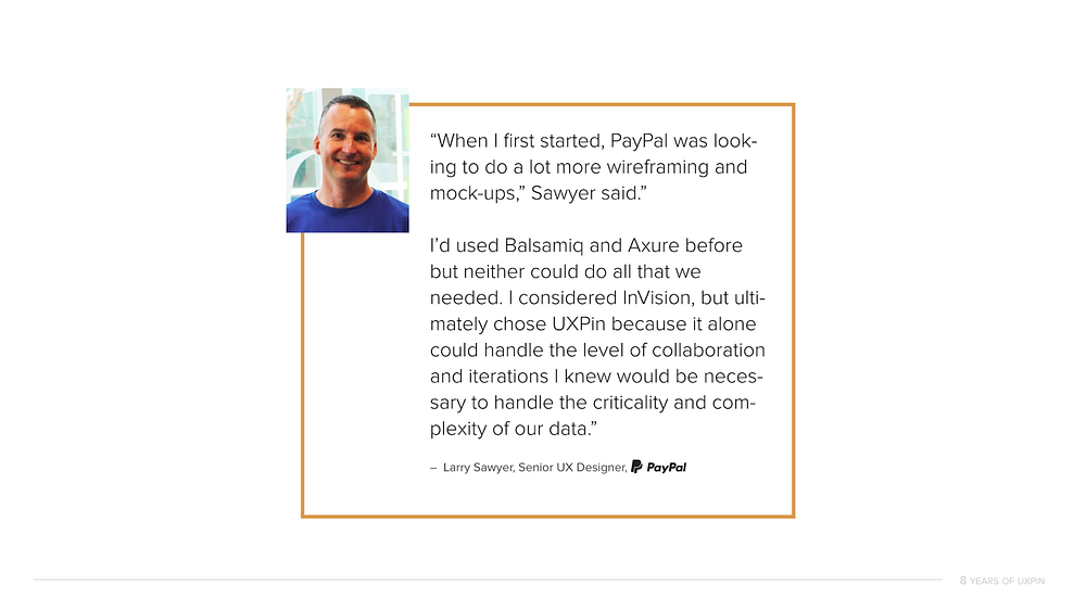
That said — a key moment in UXPin’s path to becoming a leader on the enterprise market was introduction of solid account management and professional services. We offer personalized help in switching from any other tool to ours.

4. Designers and engineers are ready to ditch the image–based design tool paradigm.

When working on the first software version of UXPin, we knew that in order to one day realize our mission of merging design and engineering into one unified process, we cannot follow other design tools. We couldn’t create yet another vector tool.

Vectors keep designer in the world of completely different constraints than engineers, and it’s the tip of an iceberg of problems of siloed design and engineering processes. Different visualization during the rendering process, lack of states of elements and component–level interactions in a design tool, no way to truly test highly dynamic products… the list goes on and on. Vectors were just never created to support dynamic interfaces and hence, cannot serve modern processes.

We needed to create a tool that’s fundamentally different — one that, without falling into traps of Dreamweaver and such, will have a code–based rendering engine.

Yes, UXPin, in basic design actions, may look and behave like our vector competitors. However, whenever you draw something on the screen — we build HTML and CSS behind it. When you add interactions — we create JavaScript. The goal is not to create production-ready code, it’s to keep you within the constraints of real development, while providing the realistic environment for ultra–interactive prototyping. HTML/CSS and JavaScript are all responsible for the magic of UXPin’s accurate rendering, conditional interactions, state-based animations or powerful expressions.

One after another copies of Sketch were gaining some market excitement (rarely traction) and we were wrestling with the browser and complex code.

Things started to change though. With the growth of design’s importance in software development, growth of design organizations and a constant expansion of agile methodologies, companies started to look for tools that scale with the entire product development. Those cannot be based on vectors. After all, vectors push designers to the corner of artists and engineers to the opposite one of builders. This rivalry is not the way to scale anything.

Suddenly, everyone wants a code–based tool. It just so so happens that… this is exactly what we have.

In the last 12 months, you might have noticed that we’re talking way more about our code–based nature on the market and we’re launching more and more features that take advantage of our paradigm. The best part is… those features cannot be recreated any vector tools. We’re escaping the crowd.

Among those unfeasible-for-vector-tools features is UXPin Merge — our technology that imports production React.js components to UXPin’s design editor. All data and interactions included! Merge is currently in private alpha and soon is going to be available to the general public. We could not be more excited. Watch a recording of our webinar held on December 6th.

5. Stick to your mission.

Finally, if you believe in something — stick to it. Eight years ago, there were many temptations to turn UXPin into something completely different. But we stubbornly decided to stick to our original mission of merging design and engineering into one, unified process of software development.

While more than once it seemed crazy, it paid off to be consistent.

Here’s to another 8 years of UXPin! Thank you all for your constant support. We wouldn’t be here without you!


This article was originally published here on Medium.
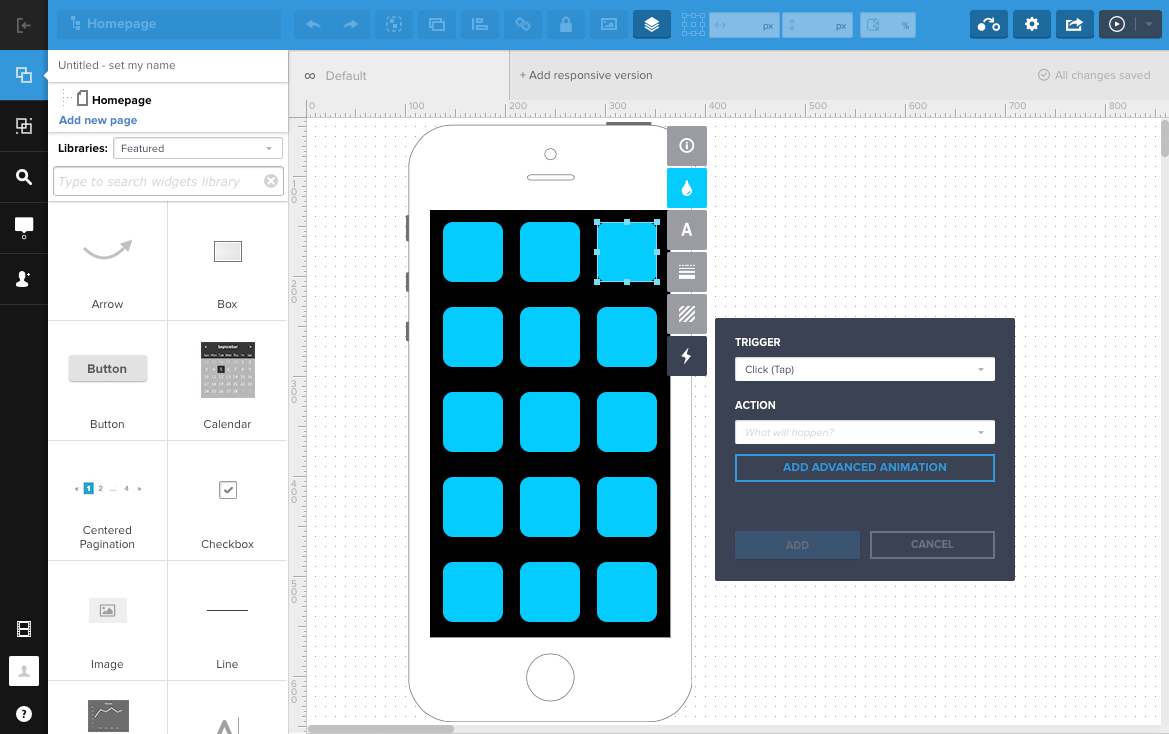
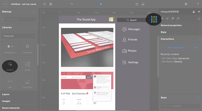
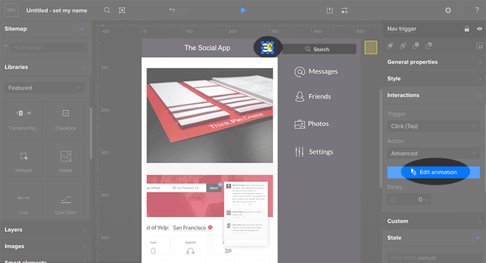
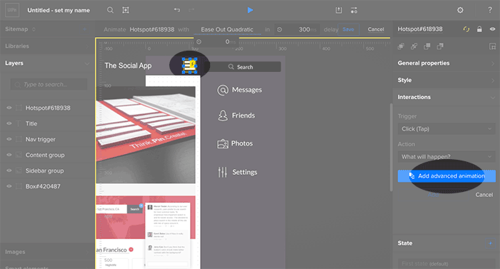
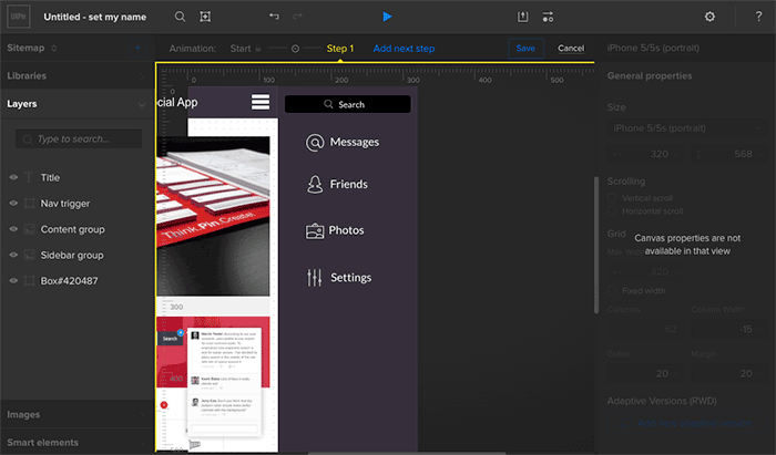
Share Sneak Previews of Your Prototypes With Device Frames

Device Frames

You no longer have to imagine what your final prototype will actually look like on a device. UXPin’s new Device Frames… at your service.

Imagine you’ve just poured your blood, sweat and tears into an important design project. You’re ready to shout it from the rooftops and share it with the world. But first, you want your stakeholders to preview it in its full glory—in real life. Enter Device Frames. Device Frames allow you to add mockups of mobile devices for a contextualized preview of your prototypes.

With this update, we’ve added two extra features:

  • You can change the color of the background and add/remove shadow for the device mockups on preview. This gives designers extra powers to control the presentation of their project to stakeholders.
  • Use user finger simulation on preview for mobile devices. Now for mobile prototypes, you’ll see a circle simulating finger instead of a desktop cursor. This adds to the realism of the experience on preview.

Why you’ll love it

Previously, you’d have to download a device mockup from somewhere and upload it to UXPin to preview it. Fortunately for everyone, now you’re able to automatically add the right device image/frame to your preview based on your canvas size. So not only can you beautifully present your design in the context of the right device, it’s automatic too!

Also, you can trust that they’ll see exactly what you intend for your prototype to look like. These digital mockups will help the viewer truly understand what you’re trying to present as the final result, on all its different displays. To show stakeholders the final UI in real world context. Additionally, it benefits designers’ workflow; so you can check out how the design looks like on the real device and adjust it wherever needed to get the best result.

The Device Frames for your designs are not interactive— they are static and for aesthetic preview purposes only. You can preview your prototypes on iPads, iPhones and WatchOS, as well as Android phones and tablets.

This is the first step in our plans to step up our Responsive and Mobile Design game. We’ll be releasing the UXPin Mirror app  soon, to preview your prototypes directly on an iOS/Android device. Stay tuned!

Reflections on UXPin’s 8th Birthday

On November 11th, UXPin turned eight!

Time flies! In 2010 I was 24, working as a UX Manager at a thriving Polish eCommerce company and, after several unsuccessful attempts to start a tech business (the youthful energy!), I took a break from any serious side projects. However, I still wanted to channel my energy towards something productive; 9 to 5 was never really an option for me. Instead of pursuing dreams of a tech breakthrough, I decided to team up with two friends and enjoy exploring the problem that bothered us for years — design — engineering collaboration. Without any business goals in mind, we started to think about helping designers and engineers work better together. The problem was very close to our hearts, we just didn’t know what the solution could be.

Freed from the constraints of a firm idea, we considered multiple options. A workshop or conference? A book? Some sort of software? Physical product? We casted a wide net.

After couple of months of creative explorations, we settled on the idea of… a paper prototyping notepad.

We believed that if designers and engineers could use the same tool, they could find the common ground for collaboration. Paper seemed to be the solid foundation for what we wanted to accomplish. After all, everyone is familiar with paper and can use it for creative purposes. The only issue? Not everyone can draw. Somebody who isn’t comfortable sketching will likely be terrified of sketching in front of others. We decided to eliminate this fear by providing designers and engineers with a set of predefined, generic user interface elements printed on sticky notes. Instead of drawing interfaces you could simply pin (yes! This is why we’re called UXPin!) elements to paper. Anyone can do it!

Early visualization of the first UXPin product. November 2010.

Fast forward a couple of months of prototyping and testing our tool, searching for the right manufacturer and waiting for the production to finish — on November 10th (one day ahead of schedule!) we were ready to launch UXPin!

Well… almost ready.

The one thing that we were missing was our… website. Ridiculous, taking into account that, in this entire project, building a website was the one thing that we felt really comfortable doing. We had no experience building physical products, but building a website? We certainly knew how to do that. And perhaps that’s why we left it at the very bottom of our list of tasks. To launch on 11th, we had to fix this mistake… and fast.

On November 10th we pulled a true all–nighter. We started designing and coding after our full–time jobs and finished at 4am. The first version of uxpin.com was the most impromptu thing that we’ve ever created. Once the website was ready, we had to wait until sunrise to take pictures of our notepads. After all, people had to see the product! I remember moving my desk as close to the window as possible to catch the first beams of sun. We were exhausted.

The original UXPin Website. November 11th 2010.

After all this hard work, our approach to the launch was as simplistic as it was anticlimactic. We announced UXPin on Twitter.

Our marketing was unbeatable 😎 . First tweet about UXPin.

We got our first order 2 minutes later. Another followed 5 minutes later… 48 hours in and we were completely sold out, deprived of sleep (massive adrenaline rush!) and unsure what actually happened (and how!). Over 400 notepads sold in 48 hours in dozens of countries. UXPin became the talk of the design town.

First UXPin pictures. Definitely worth waiting for the sun!

Some months later, All Things Digital — A Wall Street Journal tech publication, published an article about UXPin (likely the first “startup” from Poland covered by WSJ). A year later, we had turned our notepad into a SaaS application and raised our first round of funding. Soon, awards for the best startup in Central and Eastern Europe and even MIT 30 under 30 statuses followed. There was a rapid growth in number of designers and engineers using UXPin all over the world. This led to the decision to move part our business to Silicon Valley and learn to take this unexpected success even further. After months of fundraising we became one of the first Polish companies to raise capital in Silicon Valley and established our second office in Mountain View.

The legend of the web — Chris Messina was an early adopter.

Much growth, many changes, successes and failures later… here we are today. Almost everything is different. Design is more important than ever and UXPin is among the leaders in the design tools market. Thousands of companies, including world leaders of tech, automotive, finance and entertainment, rely on our platform.

One thing did not change, however: we’re still on the mission to merge design and engineering into one, unified, product development process.The task that emerged from our passions in 2010 pushes us to innovate still, 8 years later. We’re chasing the ideal software production process and that may never change. Perfection is impossible to reach, but always worth fighting for. That’s why our mission is so broad and ambitious — to push us beyond the limits of our abilities and discourage ever slowing down.

One thing did not change, however: we’re still on the mission to merge design and engineering into one, unified, product development process.

These past 8 years were nothing short of amazing. We met and teamed up with some exceptional folks (our first engineers are still with us!) and stormed through both joy and pain — always getting stronger. The experience of maturing together with your team, product and market is something that I’m going to be forever grateful for. Thank you!


Our exceptional team is always at your service! This article was originally published on Medium here.

Join the world's best designers who use UXPin.

Sign up for a free trial.

Out with Lorem Ipsum, In with Real Data

Data from our content bundles, JSON or Google Sheets

The right data, in the right place, in no time. Surprise! Now you can upload real data into your prototypes with our new Data feature. No more spending hours, even days, mocking up data for your designs. You’re welcome.

Boy, are we excited to share this one with you. You should know that this new feature was not originally on our product roadmap. One of our incredible engineers, Robert, took this on as a passion project and did this on his own time as a gift to UXPin. That’s the magic of our team.

Data allows you to fill an element with random data (avatar, name, phone number, etc.) or from JSON, CSV and Google Sheets with just one click. Either from a URL or from your computer. UXPin can automatically match all the fields based on the JSON, CSV or Google Sheet of choice. If you name your layers, it’ll automatically link that with the respective data. It’s truly that simple to use. Additionally, you can choose from many types of bundled content for random data. We’ve made sure to include a great deal of diversity for all the possible elements. We’ve also partnered with Unsplash so you can use their amazing free images directly in your prototype!


Inserting real copy into an App


This Data feature is the most complete version of this feature available on the market. The greatest value of the Data feature is that you can save an astounding amount of time. Now, you don’t need to spend what might seem like half your design career mocking up data. We’re especially looking at you, eCommerce sites and enterprises that use a lot of tables!

Whether you need mock addresses, credit card numbers, photos or job titles, you can have it all with Data. That too in seconds. The possibilities are endless.

Thanks, Robert!

Join the world's best designers who use UXPin.

Sign up for a free trial.

Introducing Adele — The Largest Open Source Repository of Design Systems

Building things was always my passion. As a kid I spent countless hours playing with weird Russian metal construction sets (I guess only kids from the former Eastern bloc know what I’m talking about), wooden blocks, LEGOs, etc.

I was the kind of kid that disappeared into his own world for hours, completely consumed by creating the next great thing.

And while over the years plenty of things about me have changed (there’s barely a cell in my body that remained untouched, for an interesting discussion check this reddit thread), the passion of building has not changed a bit.

The task of creation fascinates me so much that over 7 years ago I co-founded a startup focused on helping designers and engineers create products together. A tiny side project at first, UXPin, grew to be a real business helping the world leading companies scale their design and development. Thanks to our design, prototyping and design systems tools companies can build better products faster.

The irony is that while tens of thousands of people use UXPin to create great digital products every day, the fast growth of UXPin, elevated me into the full-time CEO position. And while there are a lot of gratifying aspects of growing and managing a serious business with a great team of over 50 professionals, I was always itching to get back to the creation side of things. So… I just did it.

There’s probably a million reasons why the CEO of a startup that has outgrown its infancy, shouldn’t build things anymore. And, in my humble opinion, non of them matter.

If 32 years on this gorgeous planet taught me anything, it’s that to be happy one has to follow the one, defining, passion that focuses the mind and makes the heart beat faster. Following this passion makes us stay true to ourselves. It makes us authentic. And, in my opinion, the only worthy path to be a great leader leads through a relentless authenticity.

The only path to be a great leader leads through a relentless authenticity.

With that in my mind, I decided to spent every hour I can, on creating projects, from start to finish, that can help others build great products.

And today, I’m ready to launch the very first of these projects.

Please give a warm welcome to Adele 💥.

 
Adele — the repository of design systems and pattern libraries

The ever growing complexity of web and mobile products have outgrown our product development processes. What used to work in the early days of the web, started to produce diminishing returns. To get a hold of the chaos of digital creation, companies started to invest into design systems and pattern libraries.

Creation of a design system or a pattern library is no easy feat. It’s a long, if not infinite, process that requires a lot of decisions. Some of these decisions are about the structure and technology. All, are complex and have a huge impact on the future of design and development in our organizations.

That’s why, while working on a design system, we tend to constantly check how others have solved particular problems. Diving into github repositories and documentation, while extremely valuable, takes a lot of time and effort. Both could be channeled towards the actual creation of new components in the system.

And this is exactly why Adele is here.

Adele is an open source repository of publicly available design systems and pattern libraries. In no time you can get a list of systems that use a particular technology, data structure or have a part of the system that you’re interested in. Whether you’re looking for react components, css-in-js, accessibility guidelines or color palettes — Adele has you covered. Learn, explore, enjoy and build better systems!

We’re starting with 43 systems analyzed in 30 categories. You can conveniently browse them on Adele’s websiteBut… there’s going to be more. From the grounds up Adele has been created as an open source tool for the community of design systems builders and maintainers.

Adele is on the mission to collect information about all the publicly available design systems. And this is exactly why Adele is open source.

All the data about systems is available as individual JSONs. Anybody can contribute by refining the data or adding new systems.

If you don’t see your system in Adele, you found some missing data, or you’re willing to add another category of data — by all means, do it! Only together we can make this repository complete.

Check readme in Adele’s repository for details about contribution.


I hope you like Adele.

I know I do. This project allowed me to get back to the roots of my passion. I had a lot of fun trying up new technologies and playing with the concepts that I’ve never explored before. And I’ve definitely learnt a ton by analyzing 43 systems 🙃.


That leaves us with the final question: why Adele?

Surprise. Adele — Design Systems Repository, has not been named after Adele — the singer. Adele is a tribute to one of the most important computer scientists focused on graphic user interfaces, design patterns and object-oriented programming — Adele Goldeberg.

Adele Goldberg worked at XEROX PARC in the 70s and managed the System Concepts Laboratory where together with Alan Kay and others she developed Smalltalk-80 — object-oriented, dynamically typed, programming language that was meant to power the “human-computer symbiosis”.

Needless to say, SmallTalk also pioneered many concepts important to all modern design systems. Objects in Smalltalk were easily transferable between applications and customizable. Smalltalk also served as the foundation of PARC’s work on graphically based user interfaces (many GUI concepts has been developed by Adele Goldberg and her group!).

Remember Adele. She’s the icon.

UXPin is the design process tool that helps product teams around the world turn ideas into products faster.

With Merge, UXPin’s revolutionary technology, companies like PayPal can easily solve DesignOps challenges. UXPin Merge allows you to design with React components to achieve full consistency with the final product.

MergeAccess Blog 14

The Future of Design Tools Isn’t Prototyping: UXPin Systems

It’s hard to believe we started UXPin 7 years ago.

Our first product was a paper prototyping notepad aimed at bringing designers and developers together, instigate collaboration and make the software development process faster.  A little bit over a year later we followed with our digital collaborative prototyping tool, with the very same goal. Since then  we never stopped  learning from our customers and building the tool that makes working together easier, release after release.

The prototyping tools market in 2011 was much different than it is today. A few companies had to do their best to sell the importance of prototyping and often the importance of design.  There weren’t too many options, which wasn’t helping us proving that prototyping matters at scale. Our first two rounds of funding were a pain to raise.  I constantly heard ‘Yeah, but who cares about design anyway. It’s a small market’.

And then everything changed. Design ate the world.

The Market Today

Since early 2017, five of the ten biggest publicly traded companies by market cap are either software companies (the main product is entirely digital), or software makes up a significant part of their revenue stream.

It didn’t happen overnight of course.

This crawling digital revolution is at least 20 years in the making and continues to inspire more and more companies to take a stab at digital. Money has the strongest magnetic field of them all.

At the very same time, the cost of producing technology continues to drop and availability of  capital increases, allowing more companies to compete. Today, it’s  is safe to say that every significant sector of software is full of options for customers. This is the era of hypercompetitiveness. The perfect time for design.

When the market becomes hypercompetitive, experience design becomes the main differentiator.

Soon, businesses all over the world started to notice that to thrive – they have to invest in design. In the last 5 years, the designer to developer ratio improved by 2.5x and the number of designers in China grew to 17 million. Design, in the past an after-thought, became the priority and the demand for design became stronger than ever.  

With the boom on the design market, no wonder the boom on the design tools market followed. Instead of a few options, we’ve started to hear about new tools being launched every other week. And this is great!

Stronger competitors energized innovation and segmented the market. Instead of providing one solution to fit all, companies started to focus on sub-segments and niches.

UXPin thrives in the mid and enterprise market and we’re widely considered the top option for teams in need of an advanced tool (take a look at these two examples of case studies: PayPal, Sapient).

We’re very proud of our prototyping solution and we’re going to continue to build it up for our customers. And I’m sure others are going to try to challenge our position and we’re going to welcome them to the market and compete.

Here’s the thing though, despite the whole influx of prototyping tools – software development did not become that much easier, faster, more reliable or more scalable.

With every new prototyping feature, every new prototyping tool, we’re becoming a couple of percent better at creating software, but we’re not making big leaps on the path to greatness. As an industry, we’re just about to hit the wall at full speed, because we’re overinvesting in small tools solving small problems, instead of addressing the biggest challenges and pushing the industry forward.

Prototyping tools are not enough anymore. We have to think bigger.

The Biggest Problems in the Design Industry

We’ve spent the past year researching the biggest problems in software development and the biggest problems in design. We interviewed hundreds of designers and design leaders, surveyed over three thousand enterprise designers, tested dozens of prototypes. And guess what? Prototyping isn’t the magic bullet.

The biggest problem in the industry: design is hard to scale.

Hypercompetitiveness on the software market and the growth of the importance of design, brought a lot of business pressure to the lives of designers. We’re constantly being asked to take over more projects, work faster and deliver better experiences. And it’s damn hard. And sometimes we simply fail. So at the biggest companies, design headcount keeps increasing. And the new designers have a hard time.

Scaling design through hiring only is a myth and path to failure.

You would think that by increasing the size of the team you’re naturally increasing speed. Trust me, it’s a myth confirmed by hundreds of companies. When you bring more and more designers without establishing certain standards, you’re triggering design entropy.

Every product, unless properly managed, is becoming more chaotic over time. It’s design entropy.

Your product is becoming more inconsistent and chaotic over time, because every designer adds their own piece to the ecosystem. These inconsistencies confuse users and developers. Product development becomes more expensive and less effective. Maintenance cost rise, which slows down design and development.

Eventually, everyone needs a design system.

And Here We Are: Enter the Design System

Style guides and pattern libraries have been around for ages.

The promise was great, but they never fully realized the value of modular, consistent, predictable and scalable design. Both are stuck in the static world, far away from the tools that designers and developers use. Documentation still needs to be manually created as a PDF, Confluence page or simply a website.  Never fully actionable. Always out of date.

Style guides and pattern libraries might have pointed at the right problems, but they weren’t the right solution.

And then some insanely smart people (Nathan Curtis, Jina Bolton, Brad Frost, Dan Mall…) and very smart companies (Salesforce, Airbnb, IBM…) started to build complete design systems, merging design and development and treating them as a process, not the final outcome.

Instead of investing months of work into building a static collection of standards, a design system becomes part of the process of building software. Instead of aiming at solving everything, a design system gradually improves the consistency of the interface and efficiency of software development.

A design system is an evolutionary process, not a revolutionary process.

Design systems establish the ever growing and ever changing source of truth for the entire design and development teams. And this is the key to scale. Every new team member, instead of starting from scratch, can hit the road at full speed with an approved set of building blocks (colors, typography…), patterns, and rules to build consistent experiences fast. Everything connects back to code, so developers can reuse rather than recreate.

Design and development with Design Systems is the future. And we’re committed to bringing this future to you – today.

Introducing UXPin Systems

I’m extremely proud to announce UXPin Systems. The new UXPin product aimed at solving the problem of scaling design and development. The first complete and actionable design systems platform.

In the first release we’re delivering four experiences:


  • Build & Document Design System
    Building a design system has never been easier. You can either start from scratch or use existing libraries in UXPin or Sketch to build the core.. Add documentation wherever needed and you’re good to go with the first release.
  • Share & Sync Design System
    By generating design system documentation with UXPin, you’re automatically creating a sharable link that stays in sync with your libraries. You can share it with the team and it’s always up to date.
  • Use Design System in UXPin or Sketch
    Everything in your design system is actionable. Every single color, style of text, icon or UI pattern saved in the system can be used across projects in UXPin and Sketch. You can update your Design System and sync it across accounts of all your fellow designers, giving you one source of truth.
  • Document Automatically
    Every project created with elements from a design system is automatically documented with data from your design system. That means documentation is generated automatically.

The Ultimate Task: Bridging Design and Development

The first release of UXPin Systems  is the result of a year of research and months of work.

Over 4,500 people participated in the early access program providing an invaluable feedback (thank you!). We couldn’t be happier or prouder.

This is just the beginning. We’re committed to helping companies all over the world build better experiences faster. Prototyping is part of this story, but on its own is not enough.

It’s a new world of design and design tools. It’s the world of systems.

Seven years ago, we started UXPin with an attempt to bridge design and development with paper prototyping. Today, we’re sure that the ultimate bridge between these two worlds is a common system of design and code.

Design and code are like spoken and written words. They represent the same concept. And UXPin helps help form the entire language to scale that communication.

Sound interesting? Sign up for a free trial of UXPin Systems now.

If You’re Creating a Design System, Read These 6 Books

At UXPin, we’ve spent the past few weeks building a Design System Solution (try it first with the early access program):

…as well as building our own design system.

Design systems are complicated beasts. They require a change in the way we think about design, the way we structure our teams and run our processes. Design systems are the language of software development, after all.

To inform our upcoming feature release and internal design system, we needed to do a lot of research. Much of that required hitting the books.

Here’s the list!

Inspiration

Christopher Alexander’s thoughts on pattern languages in architecture had the biggest influence on our design systems work. His dream of a unified pattern language which could help anybody build quality buildings gave us the energy to dream about the future of product development.

The Timeless Way of Building by Christopher Alexander

A Pattern Language by Christopher Alexander

Design Architecture

Modular Web Design by Nathan Curtis

Nathan Curtis is the prophet of Design Systems.

Back in 2009, he identified key problems affecting the consistency of interfaces and efficiency of product development and described design components as a solution. 8 years later this is still a very relevant solution.

Atomic Design by Brad Frost

Brad Frost is a terrific writer, designer, and developer. He refreshed design systems with an innovative modular architecture inspired by biology. This is the most recent and relevant description of the design system architecture.

Code Architecture

Frontend Architecture for Design Systems by Micah Godbolt

These days, writing books about frontend development is a daunting task.

Before any book gets off the printing press, it’s probably already describing an outdated tech stack and coding techniques. The speed of changes in the frontend development world vastly exceeds the speed of writing and publishing books.

Micah Godbolt nonetheless did a fantastic job of capturing the practice of building frontend architecture for design systems. While some tools might be outdated, his real-life examples and general approach are timeless. 

Summary

All these books continue to inspire us at UXPin to improve our internal design system and evolve our design systems feature.

Great Artists Reuse: Reusable Design Patterns in Product Design | UXPin

You’ve probably heard this before: “Good artists copy, great artists steal”.

The quote is usually attributed to Picasso, but there’s no proof  that Picasso ever said that, apart from Steve Jobs quoting him in one of the interviews. No matter who authored these words, they still describe an important cultural concept of remixing as part of the creative process.

Remixing is constantly pushing art towards the future, without breaking the connection with the past.

The functional nature of product design and the nuances of the Internet put a unique spin on the whole idea. You see, the Internet is a densely inhabited world in which user experience is a huge differentiator for businesses. Straight out copying others is not only embarrassing, but might negatively affect the user experience. You can’t just copy without context.

Blindly copying work of others will not make you a great designer. Working with users will.

So how do we remix what exists to build great user experiences? To start with, we have to understand the key differences between the two kinds of copying in design.

The Two Kinds of Copying in Design

In product design, copying others typically takes two forms:

  1. Mindless copying. Mindless copying (e.g. plagiarism) happens when a designer heavily borrows from a work of another designer without thinking about adaptation for users. Mindless copying is usually skin deep, lifting just the visual aspects of the design.
  2. Thoughtful reuse. Thoughtful reuse requires analyzing patterns used by other designers to adapt them or new user contexts. Thoughtful reuse doesn’t focus on copying, but rather of remixing patterns and adding them to the planned user experience.

Two types of copying in design

Thoughtful reuse is like standing on the shoulders of giants. Our new creations take what’s best in the past and take it to the next level. That leads to fast progress.

Some could argue that basing our design on what exists only kills innovation. But hardly anything in our collective culture comes to life from thin air.  Analyzing and improving what exists lies at the heart of creative nature. It roots innovation in reality.

Reusability in product design is not like running in circles. It’s more like running a spiral in which every lap elevates you to the next level.

On the other hand, mindless copying is like building on a shallow foundation – the whole experience will eventually collapse.

So thoughtful reuse and remixing is the way to go. But here’s the surprising truth:  reaching higher efficiency and improving  your craft should not start with reusing the work of others. It should start with reusing your own work.

The first person you should copy is…you. By reusing your own work you can reach new highs of efficiency and UX quality.

Copy Yourself and Share It With Others

Designers are creators. We love to come up with new ideas and bring them to life. Yet, constantly coming up with new ideas isn’t a feasible business strategy.

Whenever we try to create something completely new, when an already tested solution exists,  we incur a triple cost:

  1. Production Cost – We ask our engineers to craft a completely new code.
  2. Maintenance Cost – By building a completely new solution we double the maintenance cost. Now both old and new needs to be supported. Customer service teams need new training. Bugs will come up and require resolving.
  3. Experience Cost  – If you’ve ever redesigned a big digital product, you know that users hate changes. The reason is very simple: by changing what they know and feel comfortable with, you’re attacking their feeling of security. Building multiple distinctive solutions (or visual representations of the solution) for the same problem will just confuse users and make them uncomfortable.

Sometimes we have to accept this triple cost. Sometimes drastic changes are needed. Sometimes coherence needs to be compromised.

Sometimes… but not usually.

Usually,  a smart designer starts by analyzing what she already created (or what other designers on the team has already created) to jumpstart the creative process, avoid an unnecessary cost, and create coherent experience for users.

Rule of thumb: analyze existing patterns before jumping into a new solution.

Enter the Design System

Whenever consistency and efficiency are discussed,  one solution immediately comes to mind – the design system. If you’re lucky, you’re already working with one. If that’s not the case, you’re probably going to work with one soon. Our survey done with over 3,100 enterprise designers, showed that nearly 70% of companies either has some form of a design system or is currently working on one.

Design systems are a process of building and maintaining single source of truth for all things interface. It’s a living language of creation for digital products.

But what if you don’t have a design system, or don’t need one yet? Well you can still standardize the your existing styles and patterns.

In design, habits trump rules. It’s never too early to reuse assets in your design workflow.

Standardize Building Blocks

The first step that can immediately improve your design process is  saving and sharing the most fundamental design building blocks – colors, text styles, icons, image assets.

Saving color palettes and text styles is typically the last thing we’re thinking about when designing, but just think about all this time wasted on the constant  search for the color or style of the text used in some old project. Or worse, think about all these times when you eyeballed things and got ‘almost’ the right color, or font size and you added to the overall lack of coherency of user experience.

And yes, in the past saving and sharing colors and text styles was difficult, so nobody really wanted to do it. These days though it became so easy, that you can easily apply it to your usual design workflow.

This is how saving colors and text styles looks like in UXPin:

Everything saved in the library is immediately available to your team. Instead of checking styles in the old projects or guessing you can simply apply all the shared styles while working on your projects.

Whenever I have a unique style and color that I think we’ll use in more than one place, I save it in the library.

Saving your standard building blocks takes a second, but ends up saving hours.

But that’s not all.

Another major waste of time is sharing all the graphic assets – logos, brand images, approved product shots,  headshots, icons. Back in the days, my teams used to maintain FTP servers with shared assets. Then we switched to Dropbox, only to start using Google Drive. Every single time though the problem was that these assets were not easily accessible from within our design tools.

Now, at UXPin, we just store all the assets in a shared library. All the logos, screenshots, icons and other images are immediately available to the entire team. Huge time saver.

Standardize Patterns

Standardizing, sharing, and reusing build blocks is a great start to copying design in a way that increases efficiency and quality. But to really master reusability, you have to move to adapting and reusing entire interface patterns. Only then will you design even faster and more consistently.

The golden rule of design efficiency is:

When you use it more than once, turn it into a symbol.

Back in the day, design tools offered only masters limited in functionality that were lacking ability to override particular properties of elements, save states of elements and, often, save interactions and animations. It was very difficult, if at all possible, to create masters that were flexible enough to serve the entire team. These days are officially gone.

Forget about your old design tools with masters limited in functionality and painful to use. Those days are gone.

When we started to work on shared symbols, we had to make significant changes to what was a standard in competitive tools in the past. To fit the needs of our customers and, frankly, our needs, we had to change the status quo.

Here are our the internal requirements our product team described for UXPin symbols:

  • Text and states of elements have to be overridable (you can change these properties in an instance of the symbol without affecting the master)
  • Designer needs control what gets synced back to the master version of a symbol
  • Symbols should be nestable
  • Symbols must be shareable with the entire team and easily searchable

These might sound complex, so let me show couple of examples.

Navigation Created with UXPin Symbols

You should reuse navigation on every single page of a website. Recreating it every single time is a huge waste of time.

But simple copy/paste won’t work. What if you’d decide to change font size? Now you have to go through 20 pages and correct it. It’s going to take hours!

Simple masters won’t help either, because navigation tends to have different states depending of every page. Let’s say that you want to show the user the current location. You can’t just have one master, because then changing a state of one element will affect all of the instances. What you need is a symbol that can have overridable states.

Here’s how it works in UXPin:

The navigation pattern is saved in a shared library for easy access. Our navigation has three states (there’s a change in the structure of links depending on the sub-page) and every link has three states (default, active and hover).

As you can see, I’m simply dragging and dropping the navigation pattern and adjusting the state for a particular state (state is going to override the default saved in the library, so I don’t need to worry about the effect on other pages!). Magic!

Building Navigation with Symbols - interactive presentation

Now I need to show the active state of one of the links. I can simply override the default state in a nested symbol.

States in navigation

Footer with Nested Symbols

UI Patterns can get really complex.

When your whole team is using them (as they should!), you want to make sure that styling is easily controllable for every single element in the pattern. This is where nested symbols come in play.

Take the example of a footer. A typical footer has multiple links in it. You want to override the links (so you can link to individual pages) but control styling of whole groups of elements (like headers). To do that, you need to nest symbols within symbol so that every repeatable element within  a repeatable element can have have a life on its own.

This is how it works in UXPin:

Footer with symbols interactive presentation

Nothing really complicated, but it’s been quite the wait in our industry.

Putting it All Together

Great designers steal? Yes! We shouldn’t be ashamed to admit that we steal from ourselves and colleagues. The only kind of stealing that works in design is smart reuse that leads to new experiences consistent with the overall system.

Not only is there no shame in smart reuse, we all should do it to save time on the tedious work. That’s why our product team spent the last few weeks working on Symbols in UXPin.

Join the world's best designers who use UXPin.

Sign up for a free trial.

The Next Generation Wireframes are Microframes

Wireframes are dead! Interactive prototypes are everything!

We’ve heard these shouts for at least the past 7 years. If the popularity of these discussions proves anything, it’s that the opposite is true. The mere fact that we continue to discuss the alleged death of wireframing proves that wireframing is doing fine and continues to exist as part of design processes that fit, at least, some projects and some designers.

How has wireframing survived? It continues to evolve.

Wireframing might be a static asset, but it’s definitely not a static technique.

Long gone are the days of black on white wires built in Microsoft Visio or Excel Spreadsheets (yes, I worked with PMs who used to place wireframes in spreadsheets).

Wireframing Evolves

Today’s wireframing  has been split into multiple techniques that serve different purposes, projects or preferences of designers.

Some designers like to gather early feedback with lightweight interactive wireframes. Interactive wireframes are design deliverables that represent the high-level architecture and the most basic interactivity. Created in the span of hours instead of days, they help with user testing and getting early buy-in from stakeholders. Interactive wireframes might be destroyed soon after their birth, or evolve into a completely different asset, but that’s part of the overall concept.

Wireframes are supposed to be short-lived sketches. After their job is done they should be destroyed without a sign of remorse.

Another version of a good old  wireframe is a content wireframe. This static form serves as a structure used to plan content and information architecture before investing time and money into the rest of the interface design. This technique works great for content-heavy websites, which need a careful content strategy, before we, designers, get all creative with its form and beautiful looks. After all, content is king.

And finally, wireframes evolved into a form of even a lower fidelity. A form in which the format of a wireframe gets minimized, text is replaced by geometric shapes and every piece of the interface is simplified as much as it’s only possible.

And that’s my favorite new form of wireframing.

Enter Microframes

Microframes, or micro wireframes, are minified versions of wireframes. Through minimizing the effort, maximizing the speed and lowering the fidelity, micro-frames amplify the benefits of wireframing and eliminate most of the shortcomings.

Microframes are minified wireframes on steroids.

What are the benefits?

  • Speed. Microframes are as fast as sketching, but let you easily iterate on your work and immediately share the results with anybody, despite the location.
  • Clarity. Microframes clearly communicate plans and requirements and let designers iterate together with a customer towards the common vision, without overinvesting in disposable assets.
  • Lack of the fidelity confusion. Microframes cannot be confused with the final product, because their form is drastically minimized.

Micro Wireframes Benefits

Microframes are also extremely flexible and can be used on their own, as part of a user journey chart, documentation or even as part of a project roadmap. They serve as a cheap illustration and a tool to enhance design thinking.

And guess what? You’ve been microframing for years. You were just doing it on a whiteboard. Microframes are digitized whiteboard sketches that we, designers, used all the time when brainstorming with colleagues and clients. Unlike your whiteboard drawings though, microframes are:

  • Easy to share
  • Optimized for speed and reusability

Yes, microframes are your whiteboard drawings optimized for speed, shareability and reusability

How to Microframe?

It’s very intuitive. If you try to fit your ideas into a 200px x 300px container, the microframe will naturally come to live. To increase readability consider the following:

  • Don’t use any text. Replace text by blocks symbolizing different level of typographic hierarchy.
  • Use different colors (shades of gray prefered) to symbolize logical pieces of the interface. For example – separate CTAs, navigation links and blocks of text by assigning them different, yet consistent, background colors.
  • Use icons to symbolize elements that can be easily confused with others. For example use image icon (classic landscape icon) to show where are you thinking about placing an image.
  • Skip details. You’ll have plenty of time to add them later once the concept is crystallized for higher levels of fidelity.

Once your basic drawings are ready, think what needs to be added to enhance their communication value. Text description? Flows? There are no rules here. Whatever serves the purpose is good.

Here’s an example of my microframe documentation and flow:

Microframes Example

Micro Design Language?

To optimize your microframing process for speed and reusability you have to create your micro design language. Think about a convention that works for you and recipients of your work. Document it.

Micro design language example

Just like with a full-size design, you should start with the foundation and gradually move to higher level structures (if you’re interested in building a full-scale design system – I’m sharing my experience in this series of posts). Take all your text blocks and tiny patterns and turn them into symbols, nest them in your microframes and turn them into symbols as well.

You can get a glimpse of the microframing process here as I play around with design systems libraries and symbols in UXPin:

UXPin Symbols can be used to micro wireframe

So Is Wireframing dead?

Definitely not.

Wireframing won’t die as long as we need ways to quickly create and share digital sketches. Creating micro wireframes only enhances the communication and creativity of the team without sacrificing the speed of the process.

We’ve recently really fallen in love with this little deliverable at UXPin. Just this week, it’s helped our Mountain View team to communicate concepts for a new landing page with our Polish team.

Hopefully you’ll find it useful too!

27 Non-UX Books to Sharpen Your UX Skills

A relatively new discipline, UX design is greatly influenced by psychology, business, and architecture.

UX does not live in a vacuum.

As a psychologist-turned-designer-turned-entrepreneur, I’d like to share with you all the books that helped define my current approach to UX strategy and process. As I’ve learned in the past 6 years since cofounding UXPin, the right design solution is rarely linear – you might achieve surprising breakthroughs when you attack a problem from a completely new angle.

Here’s my favorite non-UX books for UXers.  

Psychology

1. The Feeling of What Happens: Body and Emotion in the Making of Consciousness

2. Who’s in Charge?: Free Will and the Science of the Brain

3. Cognitive Psychology: Connecting Mind, Research and Everyday Experience

4. A Whole New Mind: Why Right-Brainers Will Rule the Future

5. Brain Rules (Updated and Expanded): 12 Principles for Surviving and Thriving at Work, Home, and School

6. Thinking, Fast and Slow: Daniel Kahneman

7. Human Information Processing: An Introduction to Psychology

8. Influence: The Psychology of Persuasion, Revised Edition

9. The Power of Habit: Why We Do What We Do in Life and Business


Philosophy

1. Elbow Room: The Varieties of Free Will Worth Wanting

2. The Conscious Mind: In Search of a Fundamental Theory

3. The Mystery of Consciousness

4. Tractatus Logico-Philosophicus


Marketing/Sales:

1. Neuromarketing: Understanding the Buy Buttons in Your Customer’s Brain

2. Predictable Revenue: Turn Your Business Into a Sales Machine with the $100 Million Best Practices of Salesforce

3. Traction: A Startup Guide to Getting Customers


Architecture:

1. Eichler: Modernism Rebuilds the American Dream: Paul Adamson, Marty Arbunich: 0082552021849: Amazon.com: Books

2. Building for Better Living

3. Neutra: Complete Works


Industrial Design:

1. As Little Design as Possible

2. Less But Better

3. Keep It Simple: The Early Design Years of Apple


Business/Strategy:

1. The Entrepreneur’s Guide to Customer Development: A cheat sheet to The Four Steps to the Epiphany

2. Good Strategy Bad Strategy: The Difference and Why It Matters

3. The Hard Thing about Hard Things

4. Only the Paranoid Survive: How to Exploit the Crisis Points That Challenge Every Company

5. Scaling Up: How a Few Companies Make It…and Why the Rest Don’t


My Top 5 of All Time Picks

And to make it easier for you, here’s the top 5 I’d start with.

Psychology: Cognitive Psychology: Connecting Mind, Research and Everyday Experience

image02

Understanding human cognition is an essential to designing optimize solutions. This book by Goldstein is a decent introduction to the subject.

Philosophy: Tractatus Logico-Philosophicus

image03

Being a great UX designer requires a great thought discipline, organization and intellectual honesty. Tractatus is a demanding lecture, but there’s no better example of pure logic applied to the thought process.

Marketing: Neuromarketing: Understanding the Buy Buttons in Your Customer’s Brain

image04

I use Morin’s framework almost every day. This is by far my favorite, and the most practical, book about the psychology of social influence.

Industrial Design: Keep It Simple: The Early Design Years of Apple

image00


This book helps us digital designers, understand how industrial designers build truly mature design systems and how prototyping empowers them to quickly churn through multiple iterations.

Business: Good Strategy Bad Strategy: The Difference and Why It Matters

image01

Great and pragmatic lesson in building a strategy. Framework described by Rumel can (and should!) be applied to any product strategy.

Hope this list is helpful! Like I mentioned in the beginning, don’t limit your knowledge and influence to only the world of digital design. And when you do return for more direct UX advice, we’ve got you covered – check out some of my favorites from our free e-book library created and maintained by active designers.


The Redesigned UXPin is Here

Today as we celebrate the release of our new version, we want to take you behind the scenes and show you the lessons we learned while building it.

The first thing we learned when embarking on a redesign was that it isn’t enough that you use your product. You can’t just eat your own dog food and leave it at that.

As pointed out in this Forbes article, no one uses your product as much as you do, and not everyone is a power user as much as you. You can only know so much by using your product yourself. But if you only do that, you can become myopic in your approach. You have to seek outside perspective from your users.

You have to talk to them and learn from them, while still eating your own dog food.

That’s precisely what we did with the UXPin redesign. We used UXPin to redesign UXPin, while at the same time spending hundreds of hours talking to our users.

Before and after of the UXPin design editor.

Learning From Previous User Experience

We didn’t embark on our redesign on a lark. After all, the decision to do one should be based on data and feedback from users.

As we said in the free e-book The Guide to UX Design Process and Documentation, you always need to know why you’re building something. You have to do a bit of legwork and research, analyzing users. We won’t get into creating user personas. If you’re embarking on a redesign, you probably already know a lot about users’ motivations, fears, mentality, and, of course, behavior.

But it’s the last bit that’s going to be really useful to you. How do users behave in your application? What works for them? What doesn’t? More importantly, do they have workarounds to accomplish what your product actually promises?

For us, past usability tests and user feedback via customer service, as well as various “engagement metrics” were strongly suggesting that the learning curve is too steep for a design collaboration solution.

Having the lowest learning curve is important to us because we’re not only a tool for designers.

image08

A close up of the redesigned UXPin editor.

For instance, Ingrid Brummer, a product manager at e-commerce site CHECK24, uses UXPin with her team because it allows her to fully articulate her ideas. As she told us, “I really appreciate that with UXPin I, as a non-designer, am able to produce really exact designs.”

Since non-designers are also involved in the design process, we needed to lower the barrier to entry.

With that knowledge, we dove back into our app, taking inventory of how we can create a better user experience across UXPin. OK, here’s where things get a little meta. As we said before, we actually used UXPin to redesign UXPin.

Why a Redesign?

Let us repeat again: a redesign isn’t a lark.

Learning from previous experience is the first part of that. Next, you have to decide why a redesign and set goals.

A redesign starts very much by asking the same questions you would before embarking on any other design project, such as “what is the purpose of this?” “What are our goals?” “How does this affect our users?”

Certainly, users were at the heart of our decision to redesign. We wanted to create a smoother experience for them all around, making it easier to use UXPin and increase the speed of our platform. But to get to specifics, these were the factors that went into our decision:

  • Design debt. Having grown fast through the years, we took on “design debt,” where legacy elements didn’t really align anymore with our vision and just bogged down the experience.
  • Experience debt. We saw visible patterns of pain from customer service and our usability tests.  
  • Practical inspiration. This may seem like a lofty goal, but we wanted a tool that inspired others to build better products. A tool that was rooted deeply in usability principles and that invoked the timeless and iconic designs of yesterday.
  • Room to grow. Our previous design and backend didn’t give us to flexibility to build out new features easily. Since we were going to overhaul our entire engine, we faced less creative constraints with our new features.

And all these reasons were for our users, first and foremost. If we sound like a broken record, it’s because we can’t emphasize enough that our users drove our decision.

image06

Using UXPin to redesign UXPin. Here you can see us leaving comments on the live preview of the prototype.

Our Redesign Process

Any design effort begins with research. And we didn’t have to look far for it. Luckily, we’d been collecting data over the years already.

We had behavioral metrics, SaaS business metrics, and customer service had data from the front lines. Finally, we had qualitative usability tests, with our existing customers.

The data gave us a jump start on our redesign process. Let’s walk through the highlights rather than go point-by-point.

Laying down your design principles

Before designing a single pixel, we outlined the design principles for project.

Think of this as a combination of requirements, our goals and our aspirations. And our research helped inform these principles.

As Robert Hoekman Jr. outlines in The Field Guide to UX Strategy, you’ll want to ask the right questions to formulate your UX strategy. You can do the same thing when it comes to your design principles. Let’s review some of those questions:

  • What’s your reason for being? This question may seem philosophical, but it really isn’t. Simply put, it’s asking you to understand how your product fits into your users’ workflows.
  • Where are you now? This is your product as it stands today. Understanding this is deadly important to deciding whether you’re ripe for a redesign.
  • Where have you been? For use, this was an easy question to answer. As we said previously, we had all the metrics in front of us. We just needed to dive deep and put two and two together.

Finally, one last question to ask and probably the most important one:

  • Where do you want to be? Where do you go from here? How do you change? And how do you measure that change? Hoekman suggests using specific numbers, which is always a good idea. For now, we’ll focus on the design aspect for this article.

Now let’s take a look at the principles we created:

  1. No distractions. Every redundant piece of an interface — lines, buttons, shadows, animations —  is a source of distraction. As such, you should eliminate it to empower user creativity.
  2. Design centric. User designs should be at the center of UXPin. Our interface shouldn’t obstruct their work.
  3. Adaptive interface. Our interface should always act in context of the user. That means any “interactive” features should be hidden until the user needs them.
  4. Space. Users should have a lot of space to work so as to trigger their creativity. A cluttered interface is a source of stress.
  5. Inspiration. UXPin design should inspire and can’t derive from design other SaaS apps. We should strive for original aesthetic inspired by the best products ever created, such as the Pilot Vanishing Point Matte Black fountain pen, Harman Kardon’s Sound Stick, Pro-Ject record player, and DALI Zensor speakers.
  6. Interactive Consistency. Interface components, icons, and fonts should all be consistent to create a predictable experience.
  7. Predictable Architecture. The architecture must be predictable and natural. Features should be placed in the right context for easy discoverability.

Design principles allows you to focus your efforts and keep scope creep at bay. Our principles certainly kept our course steady and true throughout the redesign.

Usability testing and iteration

Of course, it’s not enough to just come work off design principles and call it a day. Once we started to implement our revised UI, we took it to users to get their take and to ensure there wasn’t any big errors.

image02

An early concept built of the revamped editor, built in UXPin.

And like with our design principles, we categorized our usability goals. We knew there were a few things that we need qualitative data on:

  • The new canvas. We were making significant changes to the new canvas. We needed to know if it would distract users, turn them off or hinder their work in any way.
  • The left/right tool bars. We needed to know if these were in the way as well. Or whether users found them helpful or not. Did they understand what the tool bars were for?
  • The functionality. Would people know how to use the new interface in the same way as the old one?

One of our biggest changes in the new UXPin was the removal of the contextual menu, which is displayed next to the selected elements. In the past, many people experienced difficulty with this component. We needed to test to see if users would be okay if we removed the menu.

While somewhat difficult at first, we found that people were more attuned to having elemental options to the right bar, partially because of its similarity to other design tools.

image03

User researcher Ben Kim testing our redesigned interface with designer Jessica Tiao of Kissmetrics.  

Another key finding was the total lack of understanding of icons residing in the top bar. While some, such as search, are universal, most of the icons we employed clearly needed labeling. During our early iterations of the redesigned UXPin, labels to icons were quickly added for the usability of users.

image04

Labeled icons in the dropdown, prototype built in UXPin.

Closed beta

But you don’t just test early on. As we outlined in the Guide to Usability Testing, as a product gets into later stages of development, you have to launch it to a small, select group of testers. Call it a private release, or you can call it by the common name — a closed beta.

We put together an MVP to get in front of a small group of 50 accounts — hand-picked to participate. Right away, we got feedback on some small usability issues that we quickly ironed out.

image09

We used Slack to talk with our beta users. 

One thing that give us issues right away was our left-right bar menu. It took up too much real estate on the canvas. Based on feedback, we decided to change it up. Instead of a persistent menu, we added a feature that allowed the user to choose which menu to show, as well as a hover-show function.

More importantly, with a closed beta you’ll learn things that you’ll never be able to learn with a mockup or prototype. For example, users loved the dark version of our new UI in the mockup. But when it came to actually using it, we discovered it was hard to navigate at the smallest level of detail. We realized we’d gone a bit too far in trying to make the design too visually appealing.

The lesson: usability shouldn’t be sacrificed for visuals. With that lesson, we lightened up the dark version so that it was easier to navigate. And that’s something we wouldn’t have learned had we not let a small group of users play with the redesign.

Open Beta

Slowly but surely, we went from 50 accounts to 500 to 2,000, transitioning ourselves into an open beta.

With open beta, we wanted to gather quantitative data — looking more at hard numbers. For instance, we found our conversions to be lower at first because of some unexpected issues with e-mail onboarding, which we corrected.

image01

Our new UI also comes in a light version.

We also started to quantify the user experience as well by paying close attention to bugs and requests. Using three categories  — user pain, strategic value and cost — were able to set objective priorities around those issues. With this, we attacked the most painful issues first.

And that led to us adding labels to icons, changing inputs for radius and dozens of other improvements.

Throughout the whole beta phase, we did sentimental analysis to check the number of positive and negative mentions. Think of it as a happiness check-in.

Open beta is a great period to learn more about the redesign. What works. What doesn’t. And whether people will respond will to what you’ve built. It’s also a crucial time that can’t be skipped. If you do, you risk putting out a product that isn’t viable for a large group of customers.

Conclusion

Using your own product, you learn what is working and what is not working. It gives you a good baseline. But you have to take it further. You have to talk to your customers to give you additional perspective. You’ll learn even more.

That combined with data will allow you to tackle a redesign on your own product.

As for us, we’re not done yet. Soon we’ll release a new version of our dashboard, and we have a few other projects in the works. So stay tuned!

Join the world's best designers who use UXPin.

Sign up for a free trial.

Design Leaders Should Be Business Leaders

From Mark Templeton of Citrix, Brian Chesky of Airbnb, Jeff Veen of Typekit to Scott Belsky of Behance, we’ve seen designers make great business leaders.

In fact, Maria Giudice even argues that CEOs with design background (“DEOs”) have a competitive edge over traditional CEOs due to their empathetic problem-solving skills.

It definitely makes sense.

Delighting customers and employees is easier if you’re focused on the human being in front of you. Business leaders with a design background see “numbers through people,” rather than “people through numbers.” This difference might look small, but in the age when customer delight helps companies like Apple or Airbnb dominate unforgiving markets, empathy can really make or break your business.

So far, I’m telling the story with broad strokes. But it’s actually very personal. I’m a designer, and design manager turned into full-time CEO. I truly believe that today’s’ designers will be the product and business leaders of tomorrow.

In this article, I’ll identify traits that differentiate Designers-CEOs from classic CEOs. I’m hoping it will help designers become more successful business leaders.

And now, a personal story

In 2012, after years of working as a UX Designer and UX Manager, I followed the steps of my design idols and became a full-time CEO.

While I didn’t have any previous experience running a business, UXPin (the company I co-founded) was growing like crazy and needed my full attention. The change had to be immediate, and there was no going back. I said my farewells to design craft and design management to lead the company.

image03

UXPin’s founding team back in 2011. I’m the one in green.

The beginning wasn’t easy. Operating a small company requires extreme multitasking skills and a broad attention span. In the early days, you have to take care of everything. From the strategy, through fundraising, to marketing and even cleaning up the office.

Yet, in the span of 4 years, we’ve grown to one of the leading product design workflow platforms. We started with the team of 5 working in a tiny apartment. Today, we have over 70 people working on the platform to empower product teams in 150 countries (including companies like HBO).

Even now, after four years, I still see my design background continuously influencing every decision I make. For me, running a company is just a complicated, long, and demanding design process. I’m definitely a Designer-CEO.

How my design background influences my business leadership style

Working as a designer changes the way we perceive the world. To paraphrase a famous saying: “when you’re a designer, everything looks like a design problem”.

There’s no way and no reason to fight it. As designers, we have particular traits that improve our odds of successfully running a business.

In my own experience as the CEO of UXPin, the following principles heavily influenced my leadership style:

1. No problem is impossible.

Mentoring design interns and junior designers through the years taught me that experience creates calmness. After running dozens, if not hundreds of projects, you just get a cool head. It’s an incredibly powerful trait for a leader who needs to reflect that there’s no place for panic and despair. Focus on describing the issue, deepen your understanding of the problem, plan the solution, and measure results. My design background definitely gave me this focus on problem-solving.

2. Understanding users is non-negotiable.

In the early days of UXPin, I personally contacted every user who tried our product. I had to know if we were doing anything of value. To this day, I still like to spend time with our customers, directly through meetings and calls, or indirectly through research run by our team. I can’t even imagine operating a business without the constant effort to understand the customer. For a designer turned CEO, this is non-negotiable.

image00

User researcher Ben Kim testing our redesigned interface with designer Jessica Tiao of KissMetrics.  

3. Attention to details.  

Every designer knows that the greatest products perfect the details. The harmony of the design and the delight of the experience comes from consistency. This sort of quality is very difficult for early stage businesses, where a “good enough” MVP is great. Even if your first release is slightly embarrassing, keep quality in your immediate vision as you balance the cost of development.


UXPin 1.0 in 2011

image01

UXPin 3.0 in 2016

image02

4. Ready for constant change.

Designers know nothing lasts forever.

Today’s positive client review might take a completely different turn tomorrow. The hottest trends today might become the jokes of tomorrow. Requirements, trends, technology, tastes – designers are used to the constant change. Nothing can scare us, and this is extremely empowering in business. If you expect change, you’re never surprised and always ready to act.

5. Make the complex simple and govern chaos.

We designers always strive for simplicity in form. We despise overly complicated, chaotic objects, services, and processes. Our entire experience tells us that chaos must be governed by a planned and perfectly executed form. It seems common sense in design work, but in business, it gives us a surprising advantage over anyone else.